It’s inevitable that, as a creator, some things that you create are banished to the afterlife of your hard drive. This is a curation of some of those pieces that didn’t make the cut, but I still thought were worth sharing.
Please make sure to take a look at my dribbble page for a more extensive portfolio of these ghosts of art boards past. While this page is just a sampling of pieces that I felt were the best, my dribbble page is a more complete collection of them.
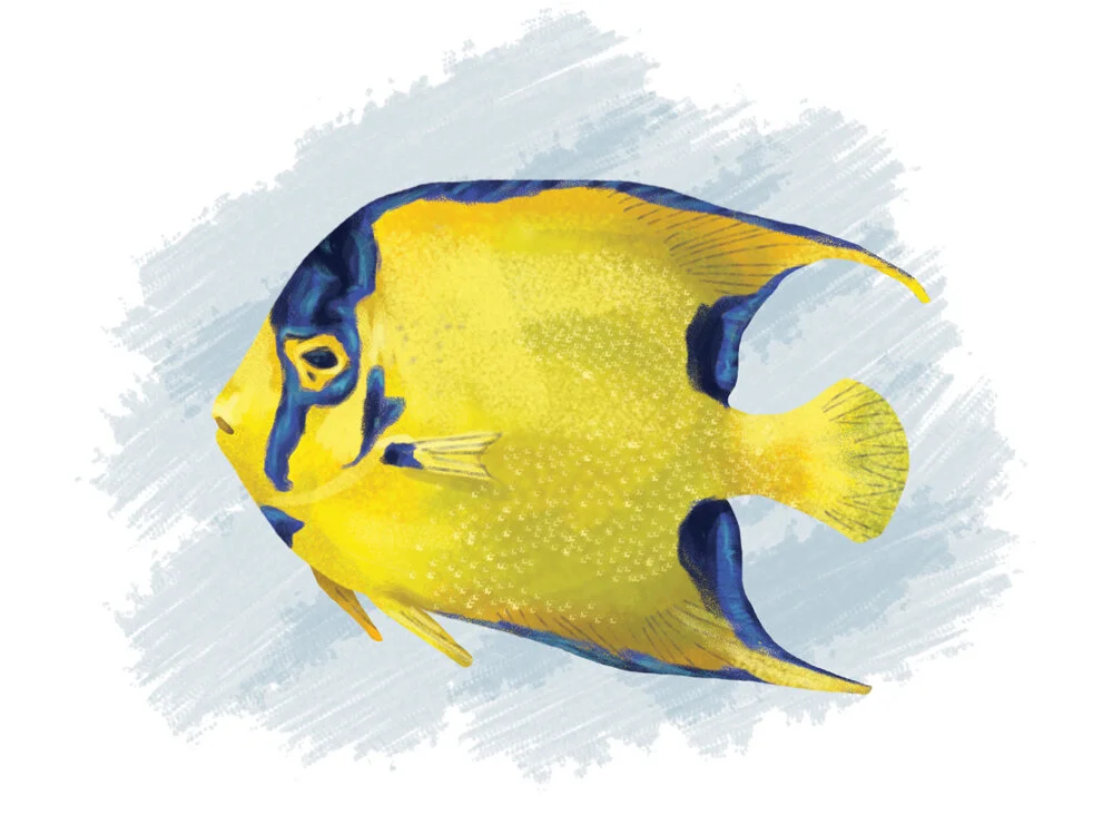
Gillustrations is a series of spot illustrations dedicated to a subject that I find very interesting; ocean life. These simple exercises allow me to keep my illustration skills sharp and explore other drawing styles.
Featured, from top to bottom
- Dolphin (AKA Mahi Mahi)
- Clown Triggerfish
- Queen Angelfish
- Blue Tang
- Yellow Tang
- Arowana
- Leafy Sea Dragon
- Red Gurnard
Part of the suite of food+beverage outlets at the new Holbrook active adult living communities, Zinnia is their casual café concept. It was conceived as a place where Holbrook’s residents could re-energize their mind and body through their healthy food offering and laid back atmosphere.
The packaging suite for Zinnia was a continued exploration of the cultured, serene, and vibrant visual identity developed by Vigor. Inspired by the brand’s namesake flower, each touchpoint blooms forth in beautiful color and stylized, geometric illustration. Accompanying most touchpoints is a curated quote that emphasizes Zinnia’s easy-going personality, and matches the use of historic quotes of its sister concepts Socialite and Maverick.
For this project, I developed all the packaging touchpoints included here and dabbled in creative copywriting for said touchpoints.
Zinnia Café To-Go Packaging Design was done for Vigor. If you would like to see the rest of the case study, click here.
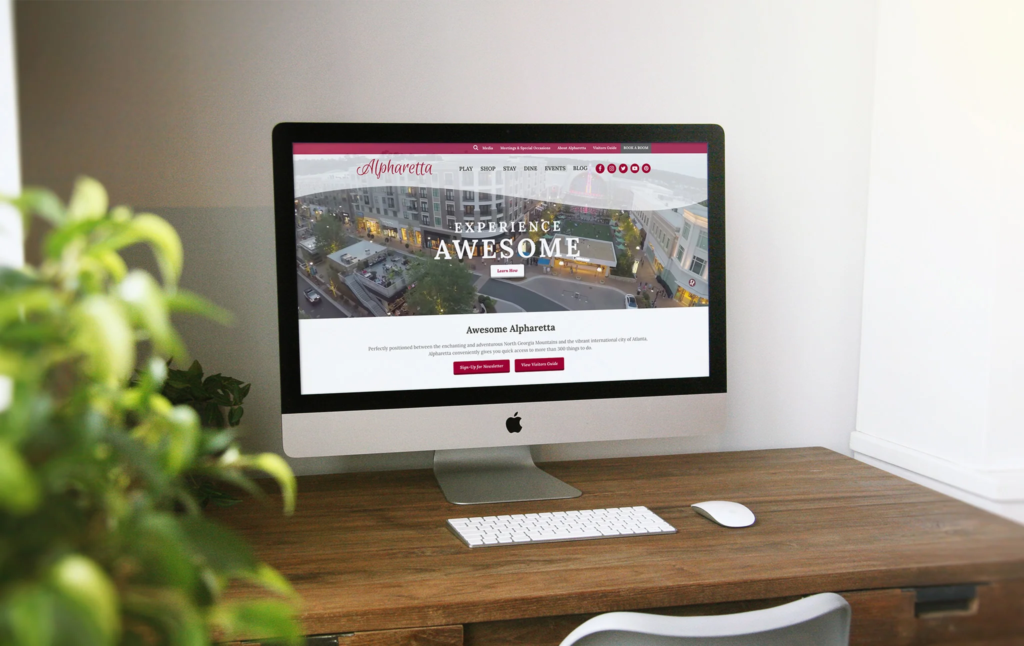
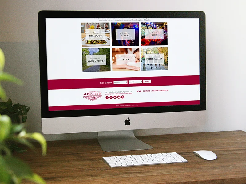
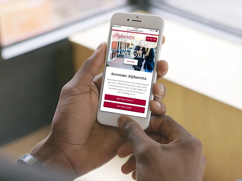
Alpharetta, GA is a suburb of Atlanta that touts itself as being pretty awesome. However, their tourism-focused website experience was anything but. The old site was clearly dated, not compatible on mobile, and due bad site organization hid all the exciting content that makes this area a worthy complement to bustling Atlanta.
The challenge? Organize this massive, comprehensive website in a way that was user-friendly, engaging, and easy to navigate while showcasing all that Alpharetta has to offer.
The first step was to get a sense of the current structure of the website, and start figuring out how to better organize the content. After coming up with five content categories, the next step was to figure out how to best display all this information. From there, I came up with the design of the home page and top level navigation, designing the site in a way that not only allowed the end user to engage seamlessly with the wealth of content, but was also particularly suited for viewing on a mobile device.
The result? A sophisticated new website that better represents the city of Alpharetta and is better suited to help guests discover what makes is awesome. How awesome was it, you ask? Within the first 12 months of the site being launched, the average time users spent on a page increased by 54%, and organic searches from Google went up by 31%. Something even more awesome; the Awesome Alpharetta website won the 2018 Gold Award for Overall Website from Marcom and AVA Digital Awards.
For this project, I assisted in content re-organization and sitemapping, wireframing, UX/UI, web design, and mobile responsiveness.
View the full, live site here.
This project was made during my time at Rhyme & Reason Design. Check out the rest of the case study on their site.
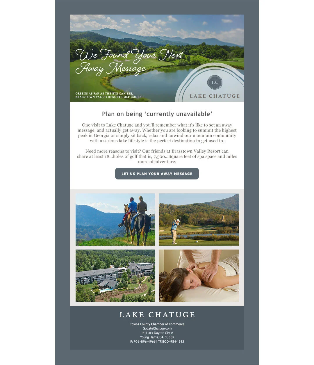
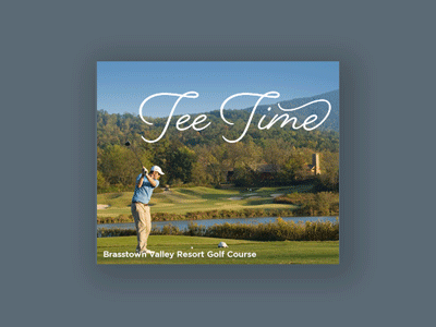
Towns County, and its only two major cities of Hiawassee and Young Harris, had a problem connecting with visitors and residents alike, losing both audiences to it’s better-known neighbors. Located on the northern border where Georgia meets North Carolina, the area has no shortage of natural splendor, including Brasstown Bald, the highest mountain in GA, and Lake Chatuge. Its’ central location to other scenic cities, such as Asheville and Blue Ridge, and laidback lifestyle make it a perfect weekend getaway from busy city life.
The problem? They had no way of sharing with potential visitors and residents why the area was worth their time. The chamber of commerce’s original name (Mountain Top, GA) said relayed nothing about the area, and the marketing materials lacked in personality. A rebrand and a new marketing plan were in order.
Looking at their competitors, Towns County was geographically different from its neighbors in a unique way: it is the only county in north Georgia that features both mountains and a recreational lake. It was a no-brainer to rename the chamber of commerce after the lake, Lake Chatuge, and market the area as the perfect year-round vacation spot. That, paired with the indulgent digs and spa at Brasstown Valley Resort, makes Lake Chatuge the ideal spot for a getaway for the adventurous and laidback types. We primarily targeted young affluent women, looking to get away from their nine-to-five for the weekend. The language and visuals reflected this new direction across all marketing channels, from the main website to digital e-communications and digital ads.
For this project, I took a logo and color scheme established by my then art director and extrapolated a visual language to be applied across the website, digital marketing materials and e-communications. Additionally, I assisted in some copywriting of headlines for the brand launch and marketing campaign overall.
This project was made during my time at Rhyme & Reason Design. Check out the rest of the case study on their site.
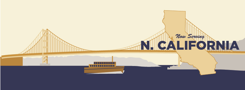
Spencer Trappist Ale is made by Spencer Brewery, the only certified Trappist brewery in the United States. The brewery was slow to progress it its distribution network across the country, and needed a way to garner up excitement with each new territory it expanded into.
For this project, I made an illustration for each new territory that was used across Facebook, Twitter, and Spencer’s newsletter platforms to announce the beers’ arrival.
Illustrations made for Solon Marketing, in Houston, Texas.
Custom illustration for Spencer Trappist Ale for their Pennsylvania distribution announcement featuring Benjamin Franklin.
Custom illustration for Spencer Trappist Ale for their Colorado distribution announcement featuring the Balanced Rock from Garden of the Gods.
Custom illustration for Spencer Trappist Ale for their Washington D.C. distribution announcement featuring the Washington Monument.
Custom illustration for Spencer Trappist Ale for their Florida distribution announcement featuring hotels from the South Beach strip.
Custom illustration for Spencer Trappist Ale for their Georgia distribution announcement featuring Georgia peaches in front of a backdrop of mountains.
Custom illustration for Spencer Trappist Ale for their Illinois distribution announcement featuring beer being paired with a Chicago dog.
Custom illustration for Spencer Trappist Ale for their Maryland distribution announcement featuring boats sailing off the coast.
Custom illustration for Spencer Trappist Ale for their New Jersey distribution announcement featuring a fun pier on the Jersey shore.
Custom illustration for Spencer Trappist Ale for their Northern California distribution announcement featuring the Golden Gate Bridge.
Custom illustration for Spencer Trappist Ale for their North Carolina distribution announcement featuring the Biltmore House.
Custom illustration for Spencer Trappist Ale for their Southern California distribution announcement featuring the Theme Building at LAX.