
At Nextbite, the creative team helped bring to life, and inject new life, into many of the virtual kitchen concepts that the start-up owned. One such concept was Wild Wild Wings. They already had a logo (which you can see here), but it was (and still is) boring and expected in the space. One internal branding exercise we did was to re-brand Wild Wild Wings, and create something that spoke to the deliciousness of the offering, while also creating excitement digitally when no brick-and-mortar experience existed.
Below are three brand concepts that I created. Ultimately, a rebrand for Wild Wild Wings didn’t go through, but it’s fun to look back on what could have been right?
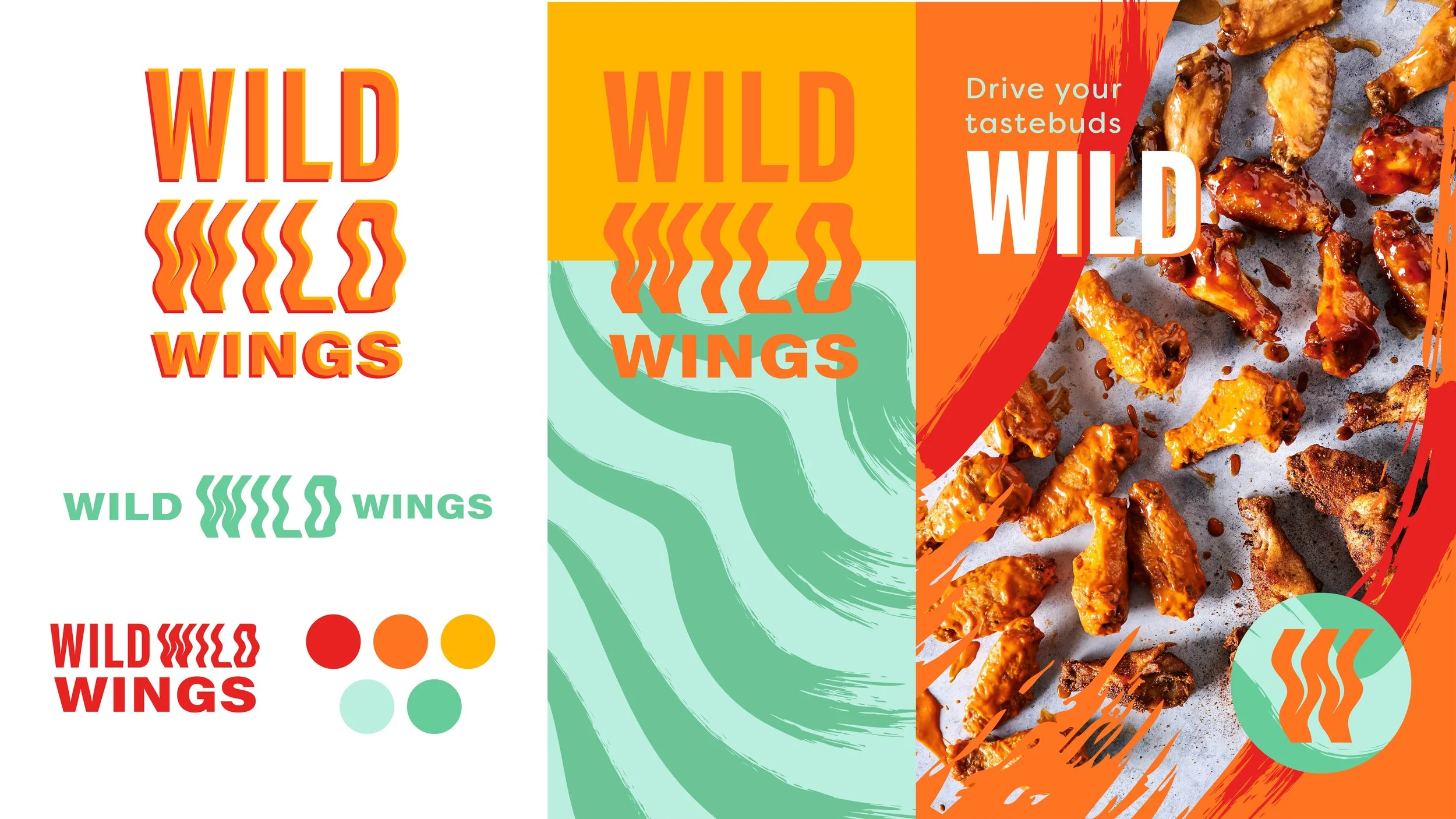
Concept 1
This simple logotype encapsulates the idea of mix-and-match; plain, legible type mixed with heatwave inspired text that could be arranged in a number of ways echoes Wild Wild Wings customization offering. Saucy brushstrokes contrast with the clean edges of the type, and mirror the appetite appeal of the offering. Yellows, oranges and reds make up the lion’s share of wing-brand color palettes, so I wanted to create something that introduced an unexpected, contrasting and attention-grabbing teal.
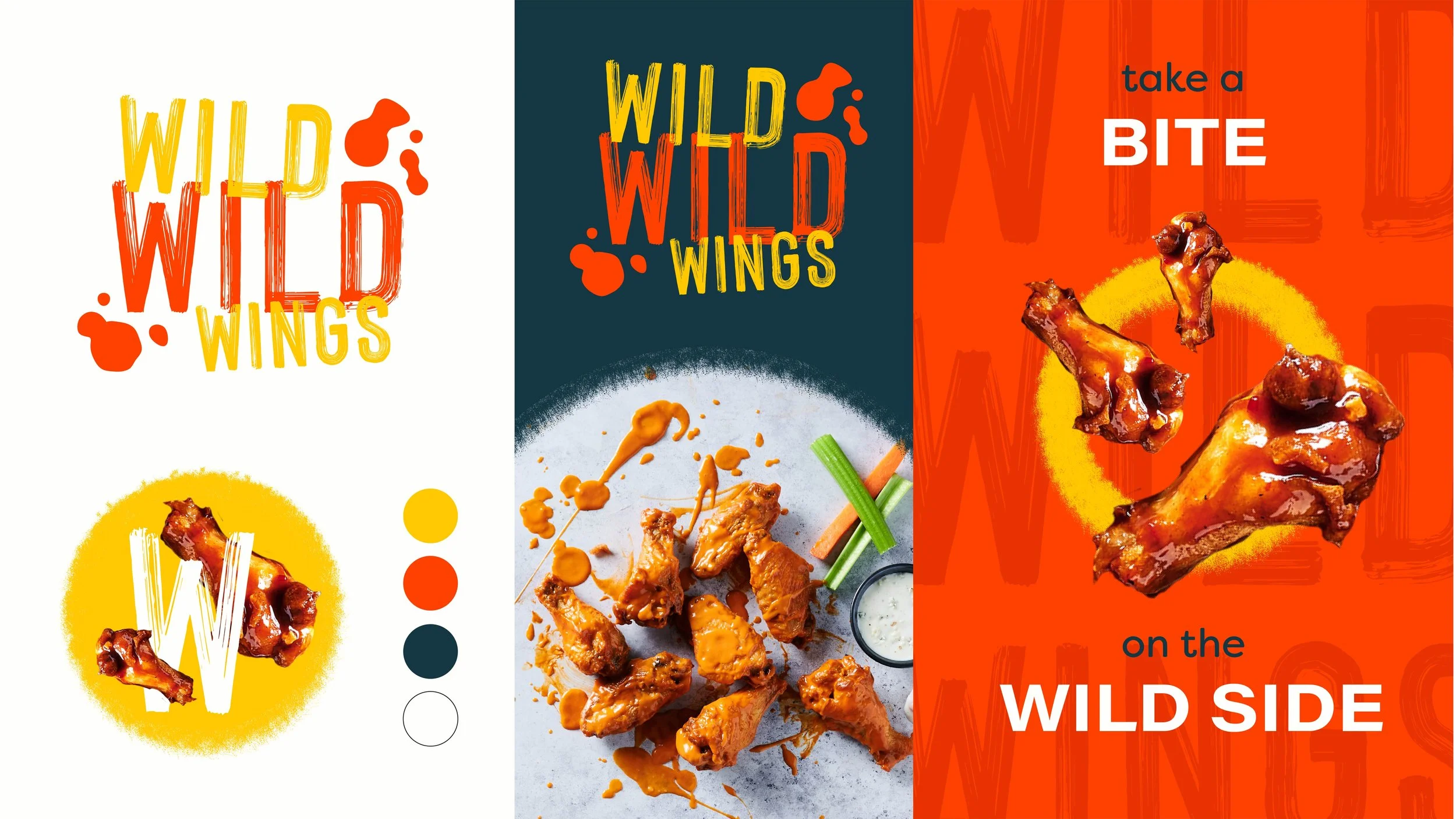
Concept 2
Skewing into more familiar territory, this direction relies on a classic color palette and visual cues to feel sporty and approachable. Saucy typography, textures and platters feels appetizing and relates to the product. Contrasting that with silouetted and playful imagery, this direction feels fresh, new and exciting.
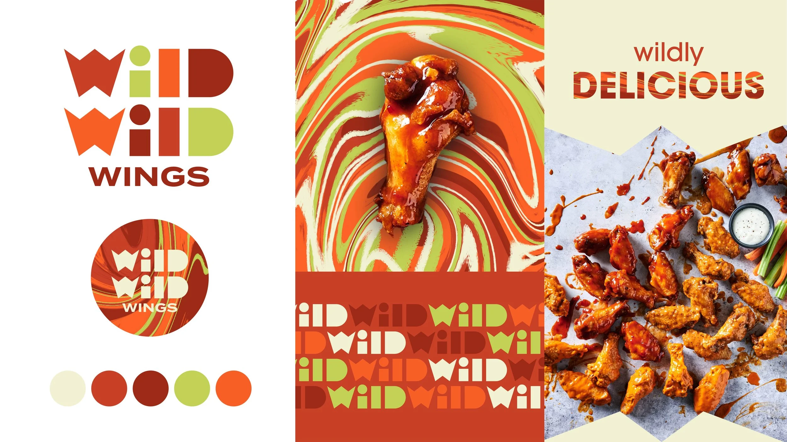
Concept 3
For this direction, I was struck by how the sauce colors, mixed with the off-white of ranch and bright pop of celery green, felt very retro and psychedelic to me. I decided to make a pattern with these colors, mixing them all together as sauces do at the bottom of a plate of wings. To contrast this swirly, funky pattern, I created a custom funky but hard-edged geometric logotype. The shapes of the letters could also be used as masks for imagery, creating a stable, architectural grounding against the melting pattern.