
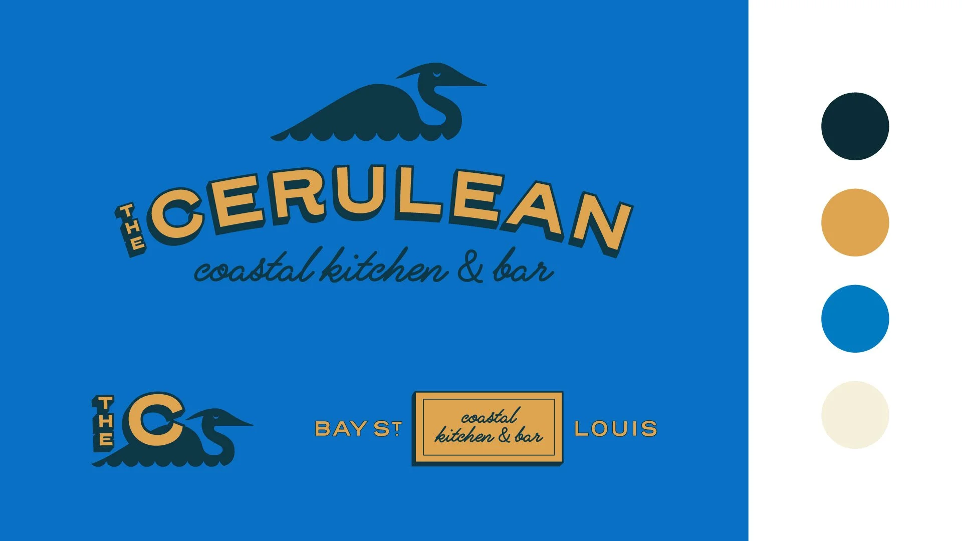
The name The Cerulean probably looks familiar. I recently posted another Project Snippet for the same brand, showcasing some of the merchandise I designed for the concept. This is an early exploration of that same brand, one that was a bit more refined and Southern in it’s execution, reflective of the higher-income patrons of the Bay St. Louis area.
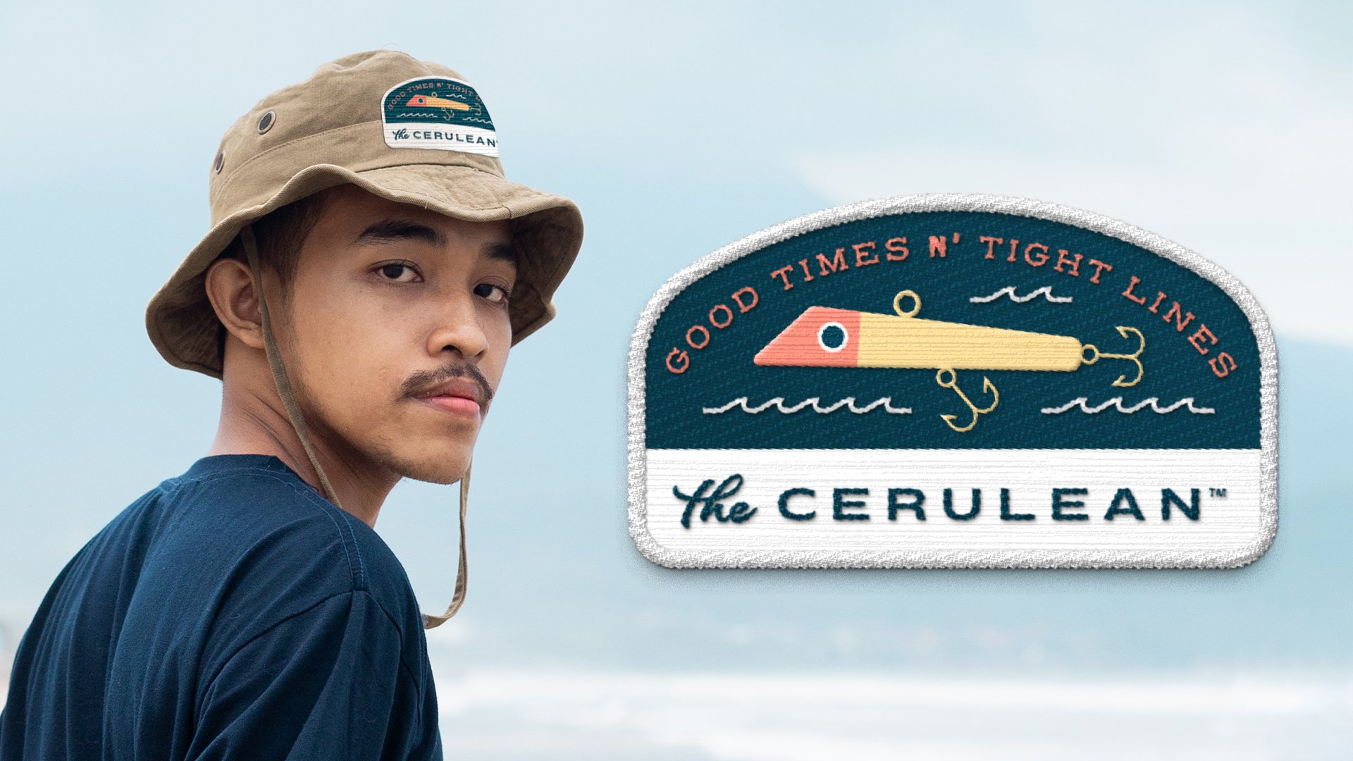
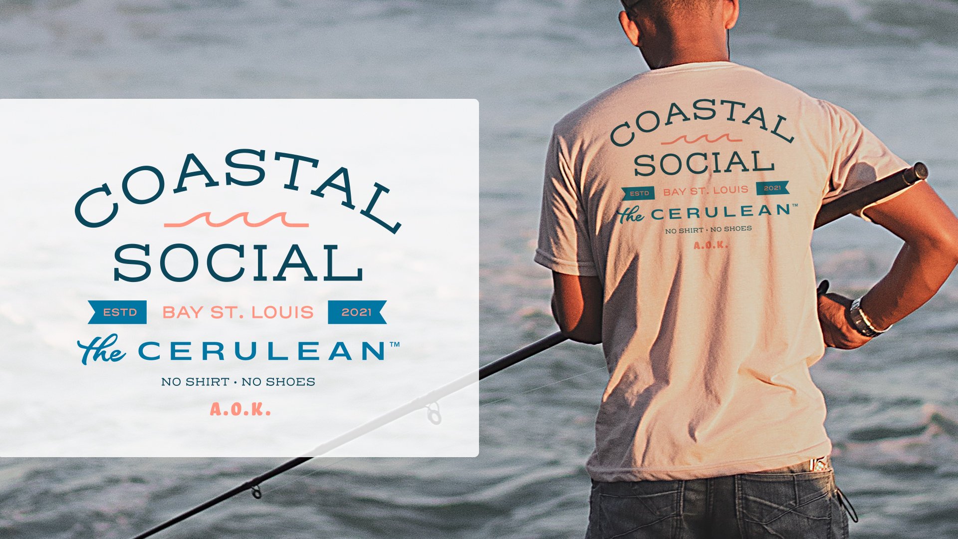
Typography inspired by classic boat name handlettering makes up the monogram and the primary logotype. A monoline script is paired with this typography to feel classic and personable. I also chose a relaxed Great Blue Heron as the brand mascot. Native to the area, you normally see these regal birds standing tall over the water or flying with their legs outstretched behind them. Instead, I’ve chosen to show the bird breezily floating along on the water. This bird is mean to represent a more refined local patron taking it easy at The Cerulean.
This small snippet of a visual identity represents the nostalgia of a bay-front seafood restaurant packaged in a contemporary way.