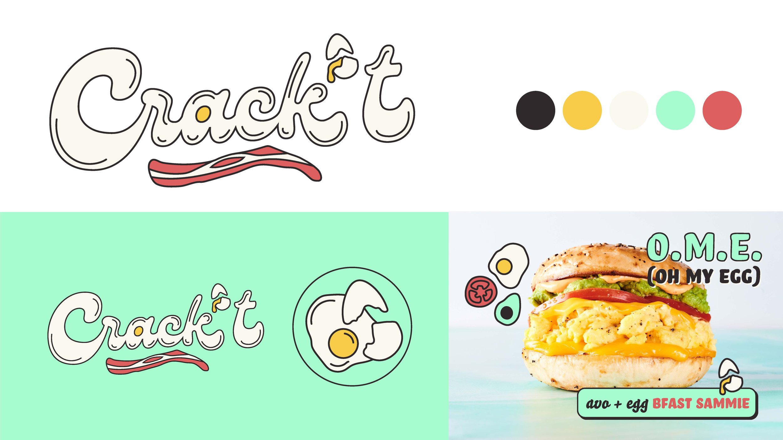
During my time at Nextbite, I had the opportunity to develop visual identities for a slew of their virtual kitchen brands. Crack’t is one such brand, and like it’s sister brand Hatch House, focused on the delivery of breakfast sandwiches. While Hatfch House took a more classic approach to their offering, Crack’t was decidedly more experimental and whimsical, offering items like a chicken and waffles sandwich.
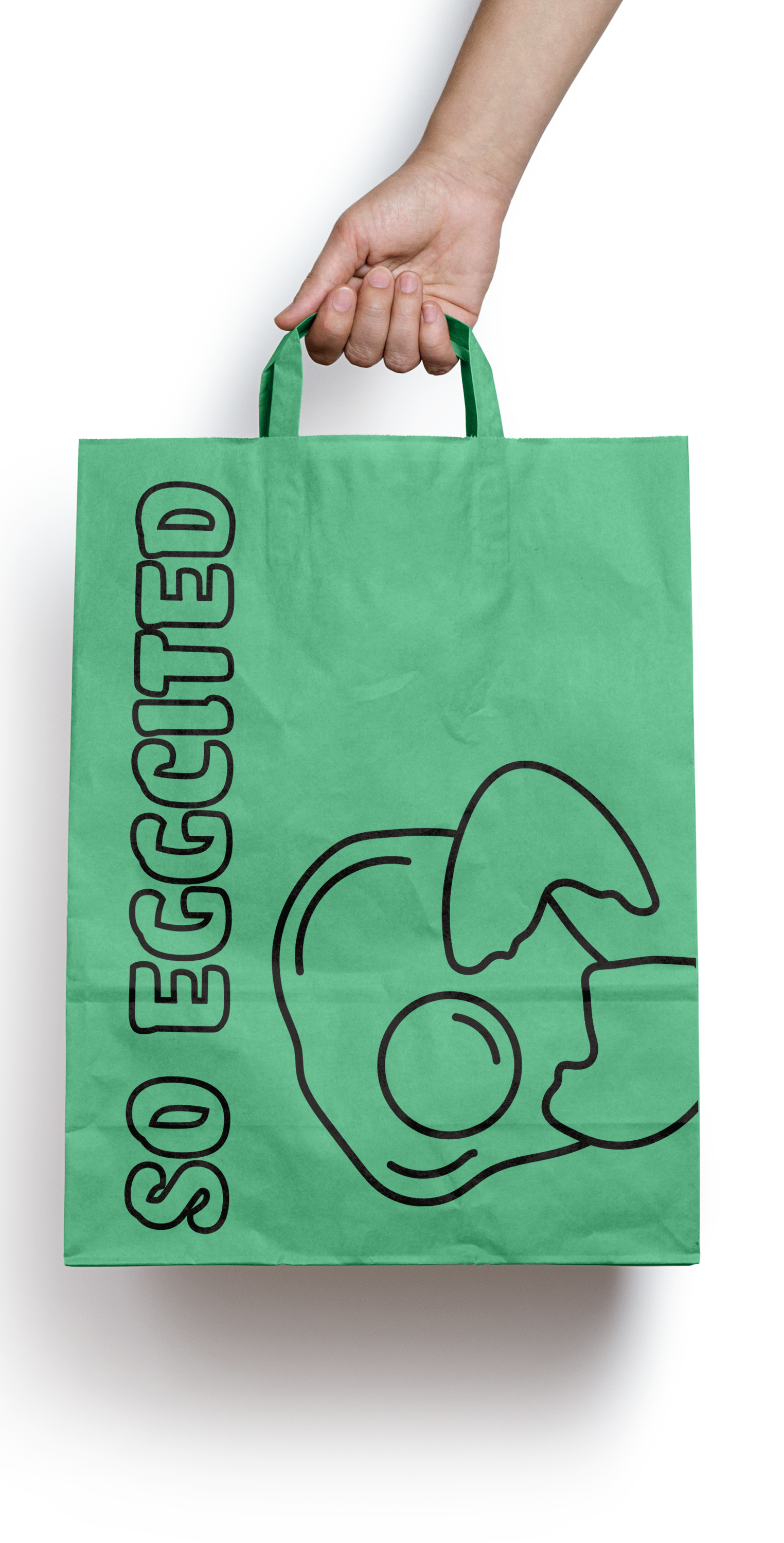
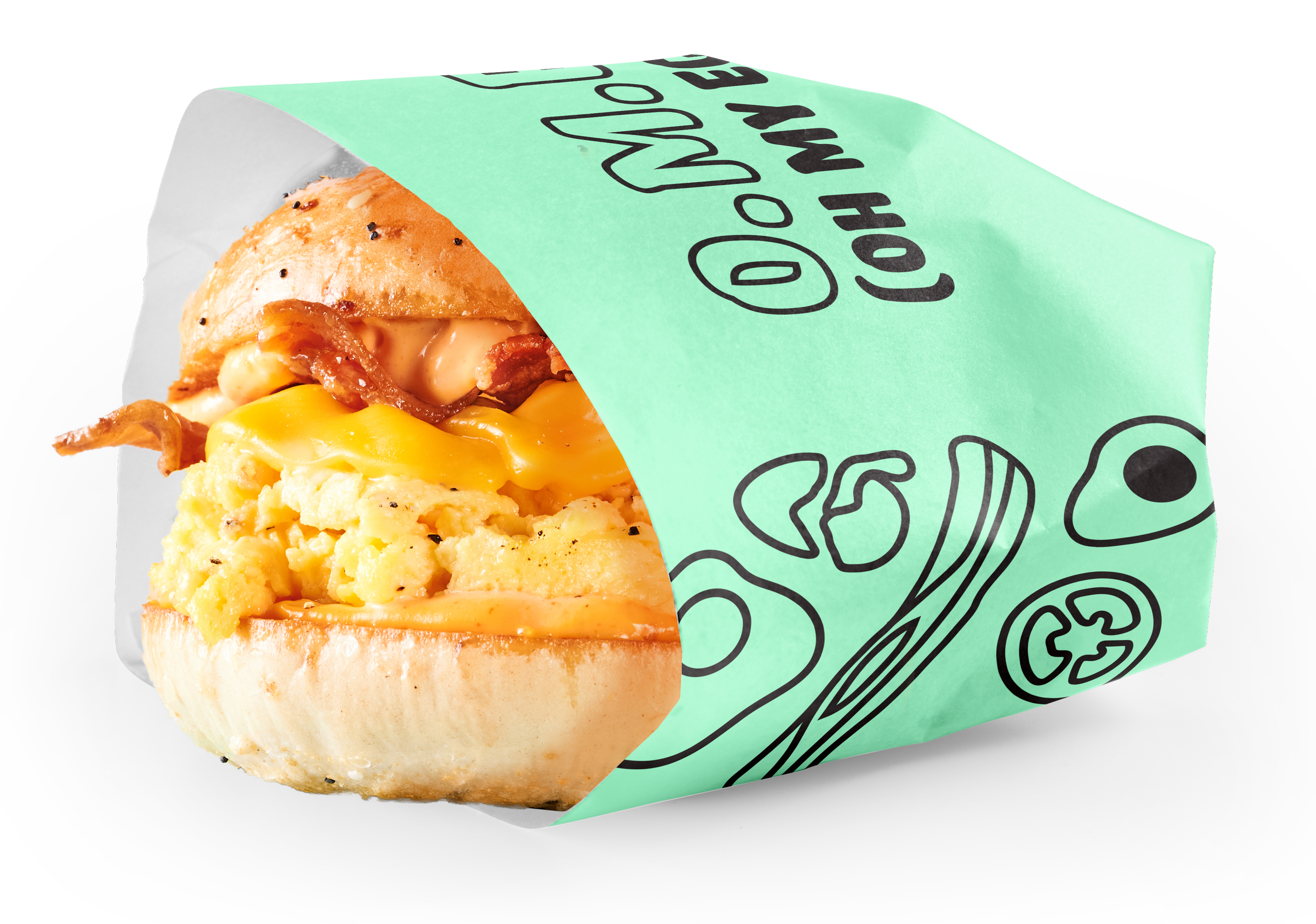
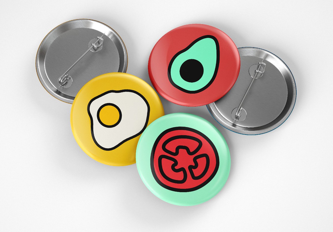
This visual identity exploration for Crack’t feeds off that playful energy, turning a retro script typeface into eggs and bacon. A cracked egg is used as the apostrophe, and an illustration system inspired by the logo is used across merch and packaging. The whole thing is tied together with a sunny and funky color palette.


