Project Snippet - Character Pieces for The Cerulean

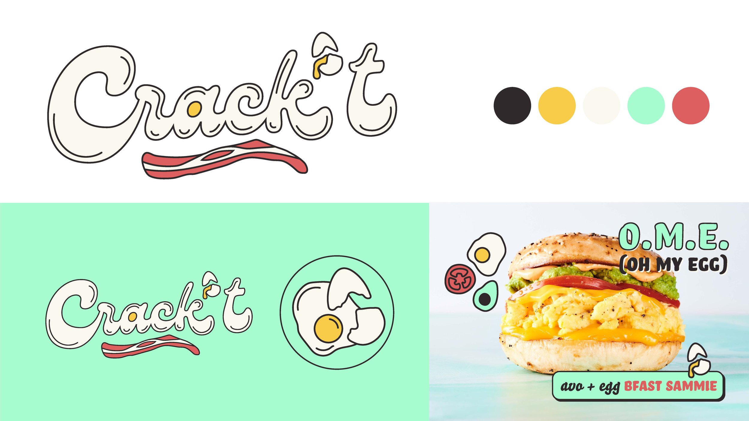
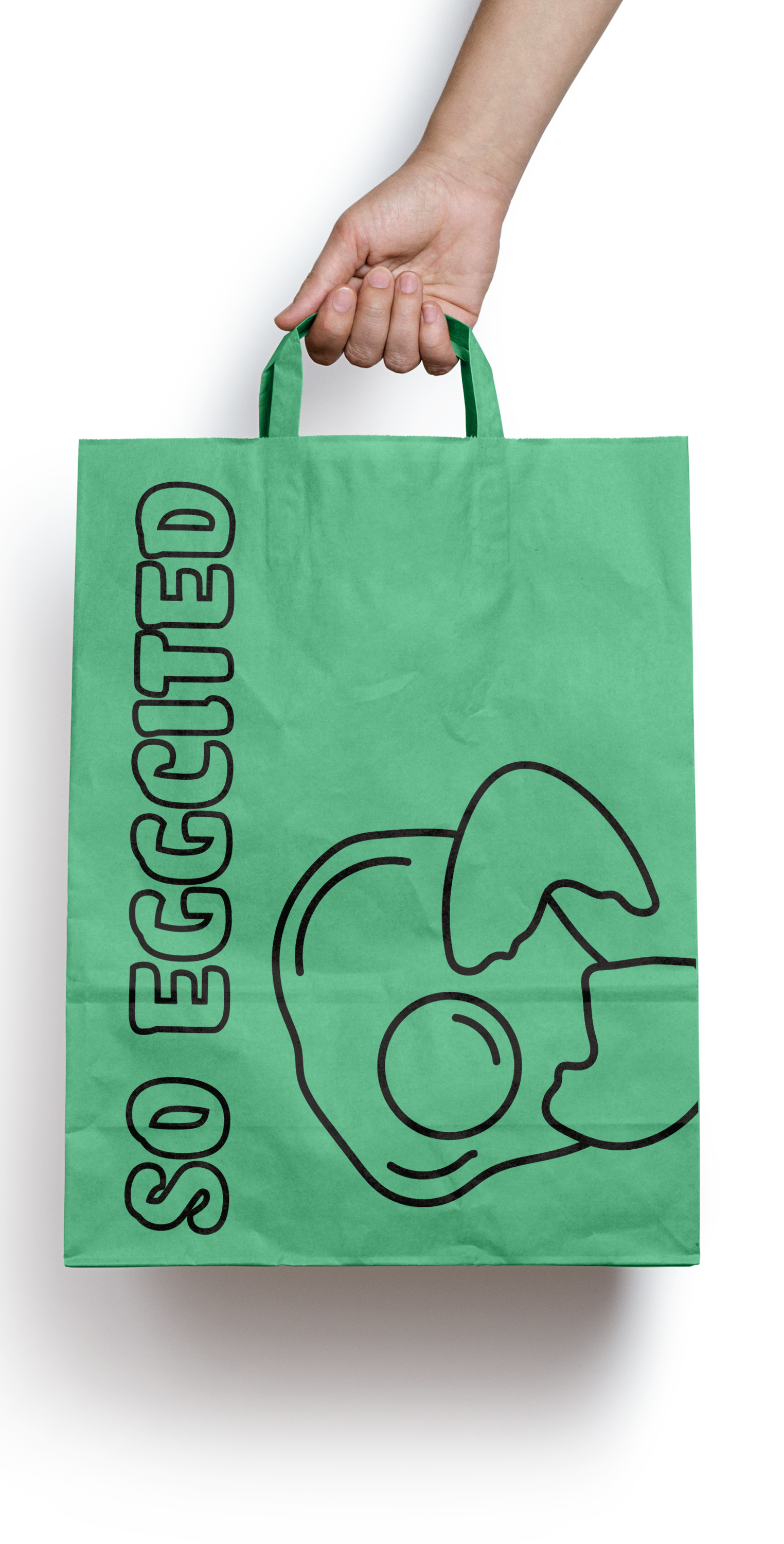
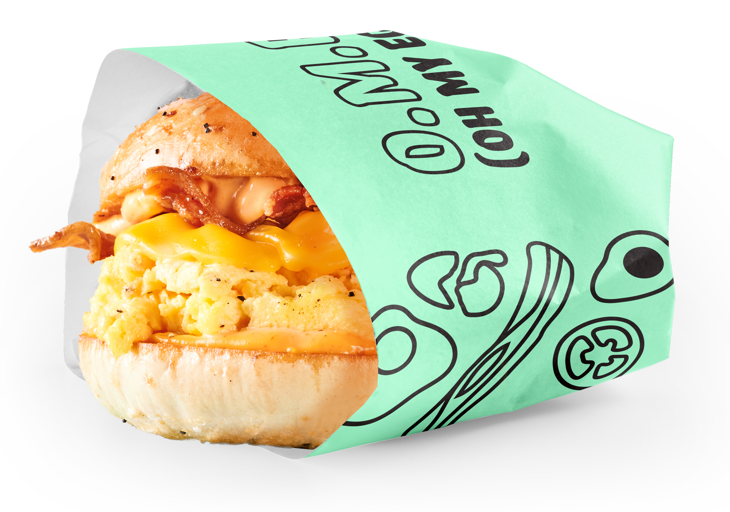
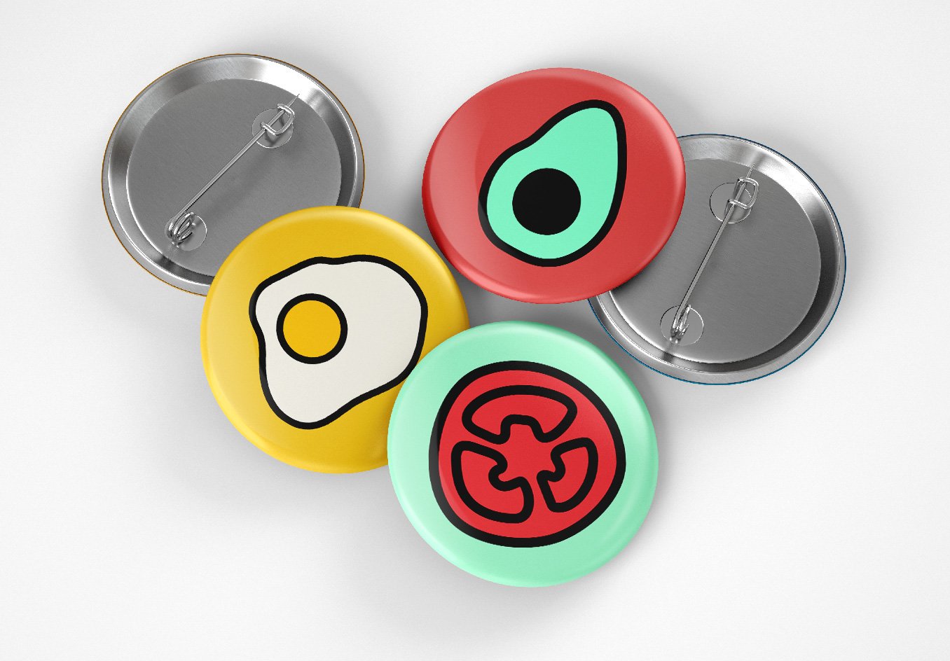
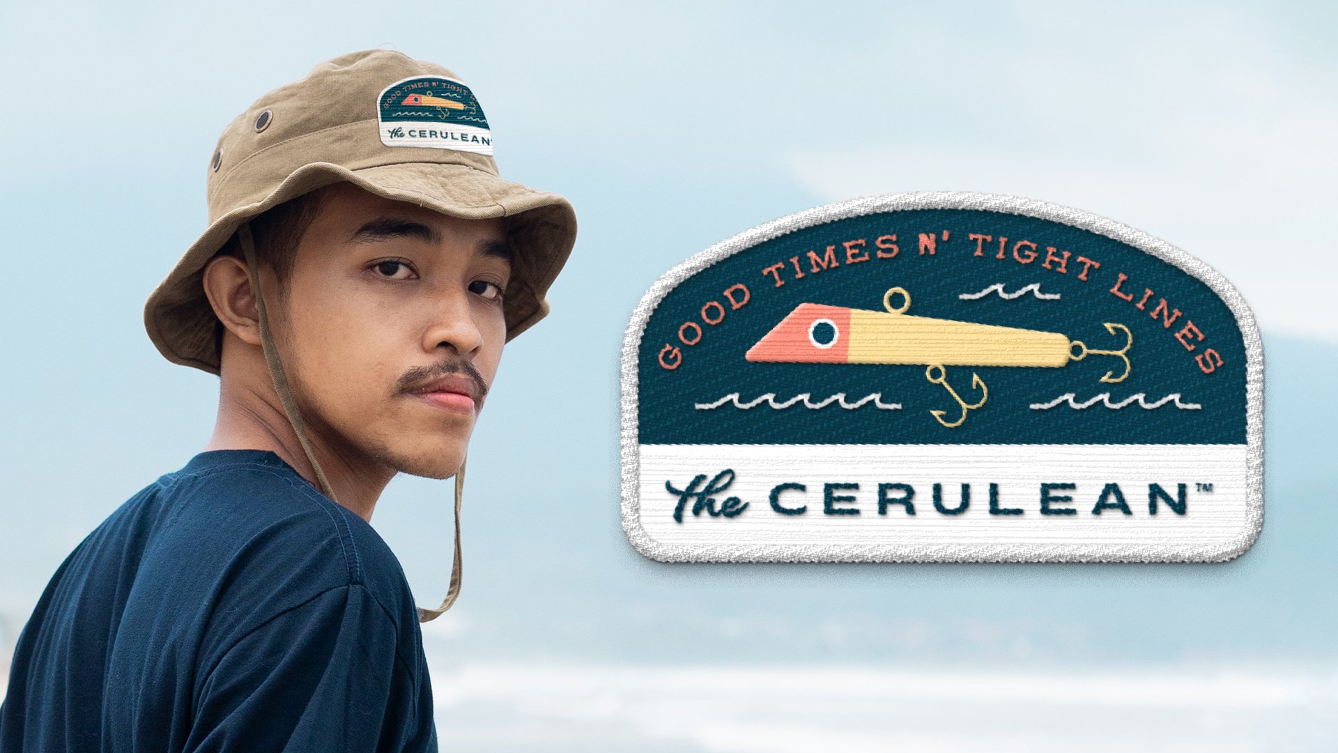
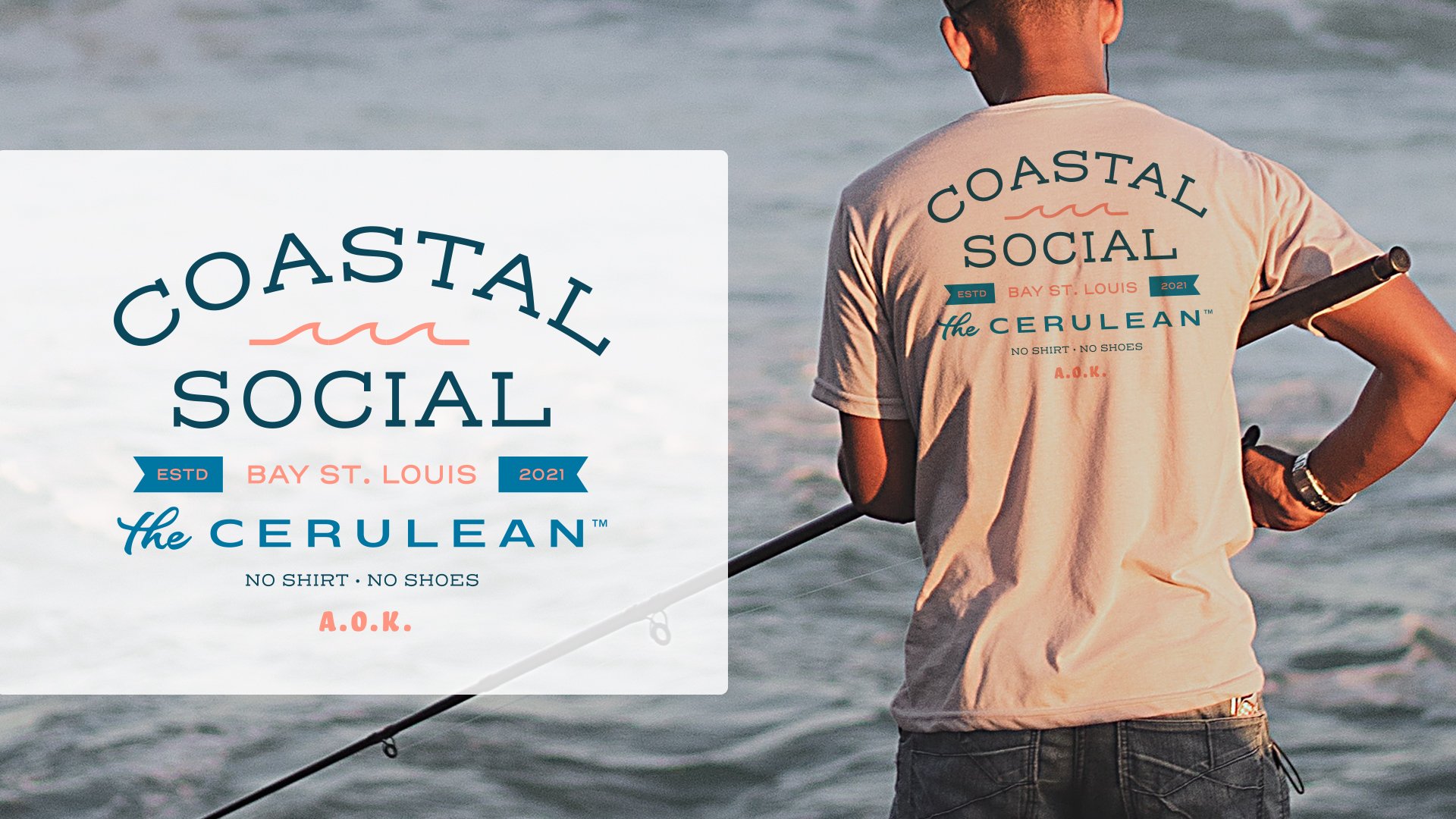
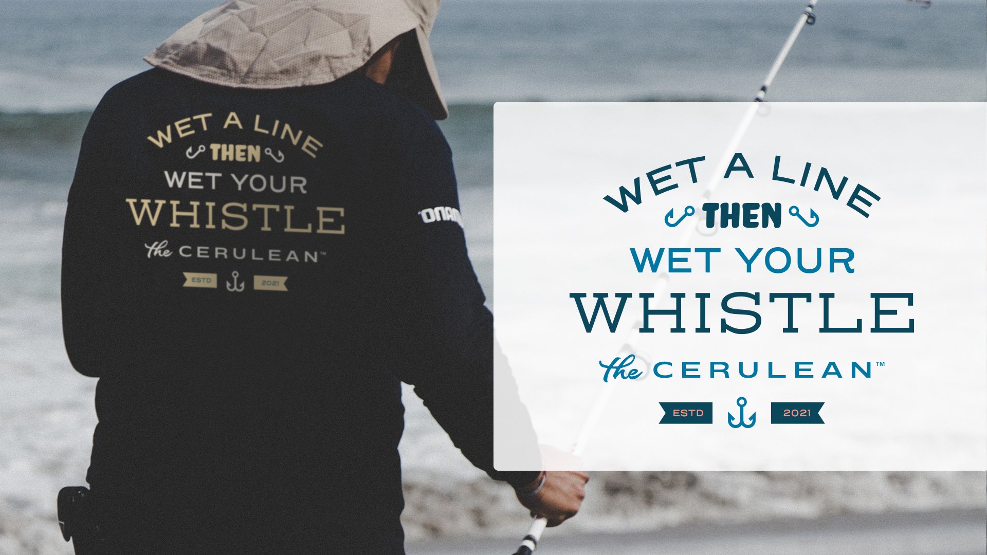
Sometimes it’s the little things that you remember most, or it’s the tiny takeaways you keep as a souvenir of your experience, allowing you to look back fondly on a certain time in your life. When designing character pieces, the thought is to always create something that speaks to that brand and reminds the patron of their fond interaction with it, but to also be subtley branded in a way where the patron isn’t transformed into a walking billboard. I am vehemently against logo-slapping for this reason; no one wants to be used as free advertising, and unless they really love a brand, they won’t wear a logo loud and proud across their chest.

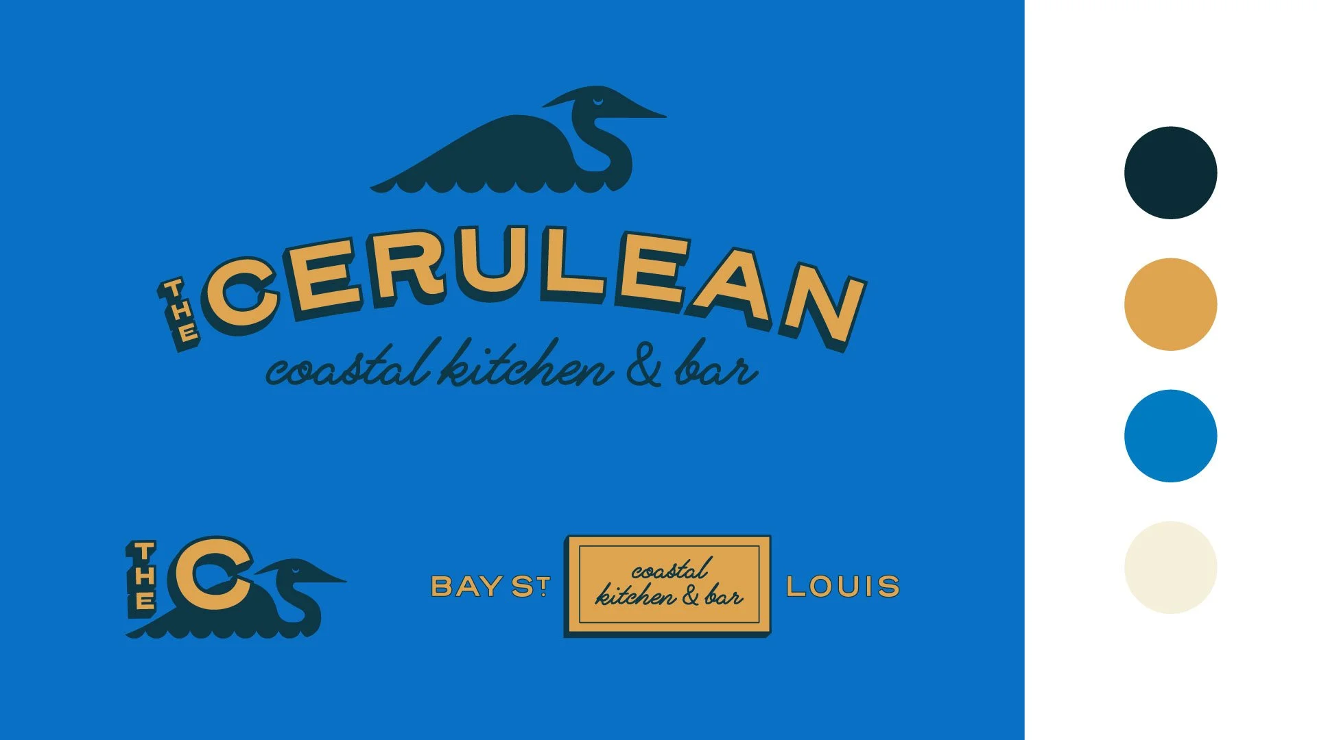
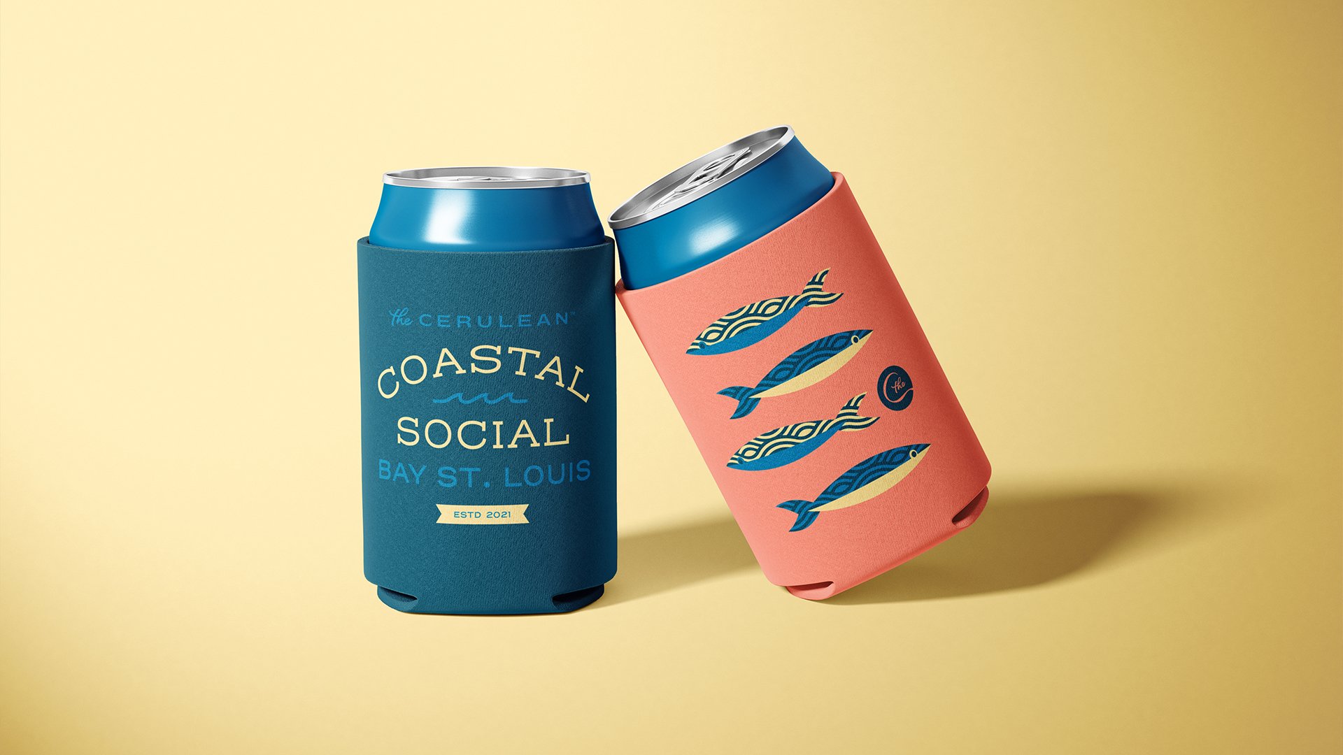
Character pieces have to also make sense for the brand. Yes, in the world of free swag and branded merch, t-shirts and pins are the norm. But just because they are the norm doesn’t mean they’re right for each and every brand. Take the character pieces below for The Cerulean, for example. The Cerulean (while still not open at the time of writing) is a laidback, casual seafood restaurant based out of Bay St. Louis, Mississippi. Bay St. Louis is a touristy waterfront town, but The Cerulean, while wanting to also appeal to tourists, is meant to be a respite for the bay-loving locals.

When coming up with ideas for character pieces, I had to put myself in the shoes of a local; thinking about what kind of items they would actually want to take home and use, and how branded these items should be. Being the more practical sort, I imagined the patron would want items they could actually use; fishing hats and shirts to protect their skin while out on the bay, and koozies to keep their beverage of choice frosty while out in the hot sun.

Project Snippet — VH Beer Can Designs

A few months ago, I featured an early exploration of what a marketing campaign could look like for a client of Vigor’s, VH Beer. Before we got to that scope of work, however, we had gone through the process of naming, branding, and designing packaging for the brewery. The directions featured below are were early, unused explorations of what can designs for VH Beer could look like.

To see where the final branding and packaging landed, be sure to check out the case study on Vigor’s website.

VHBeer_MockupD1_Slide1.jpg
VHBeer_MockupD1_Slide2.jpg

As this brewery was a new one on the scene in Denver, CO, this direction puts their logo front and center. I also hoped to create differentiation from a lot of the other over-designed colorful craft beer cans on the shelves by using a limited color palette and creating a literal white space for customers to rest their eyes from the rest of the visual noise.

VHBeer_MockupD2_Slide1.jpg
VHBeer_MockupD2_Sslide2.jpg

This direction aimed to depict the literal scenarios a consumer could find themselves in while enjoying VH Beer. Shoutout to Chia-Yu Hsu for helping me out with the illustrations!

VHBeer_MockupD3_Slide1.jpg
VHBeer_MockupD3_Slide2.jpg

VH Beer is run by the same owners of Viewhouse, a local chain of restaurants / bars. Viewhouse’s name carries a bit of weight in Denver, and so I wanted to make the connection between VH Beer and Viewhouse more apparent by focusing on a shared mascot; the Viewhouse eagle. The eagle is anthropomorphized and illustrated in various scenarios, in which they would find themselves enjoying VH Beer. Thanks again to Chia-Yu Hsu for lending his talent in bringing my idea to life.