Project Snippet - Bad Beaches Only

Summer time means one thing; crushing cold ones on the beach. While I don’t have the ability for a summer Florida getaway this year; I can live vicariously through Bad Beaches Only. BBO is a Summertime Lager, the fourth edition made in collaboration with Bottleshare, an Atlanta-based nonprofit helping those in the beverage industry through times of crisis.

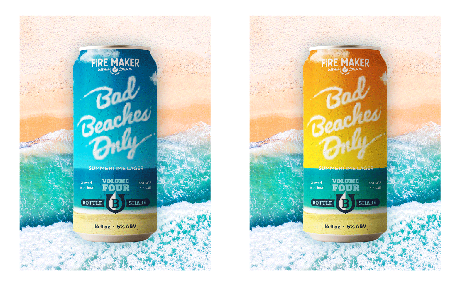
Being in North Georgia, most people go to Florida, the Georgia coast, or the Carolinas for their summer vacations. I have fond memories of growing up and going to the beach in South Florida, watching planes slowly passing over the water with banners waving behind them. It was always a treat to get the skywriters, planes that would use water vapor to write out messages in the sky. The design for Bad Beaches Only was inspired by those memories, featuring the beer name in hand-lettered clouds inspired by skywriting. Turning the can reveals the pilot, adding surprise and delight as the customer interacts with the packaging. I couldn’t decide if I liked the daytime or sunset sky best, so I’ve decided to show both.

Bad Beaches Only Beer Can Design.
 
Two colorways for Bad Beaches Only beer can design.
 

Project Snippet - Character Pieces for The Cerulean

Sometimes it’s the little things that you remember most, or it’s the tiny takeaways you keep as a souvenir of your experience, allowing you to look back fondly on a certain time in your life. When designing character pieces, the thought is to always create something that speaks to that brand and reminds the patron of their fond interaction with it, but to also be subtley branded in a way where the patron isn’t transformed into a walking billboard. I am vehemently against logo-slapping for this reason; no one wants to be used as free advertising, and unless they really love a brand, they won’t wear a logo loud and proud across their chest.

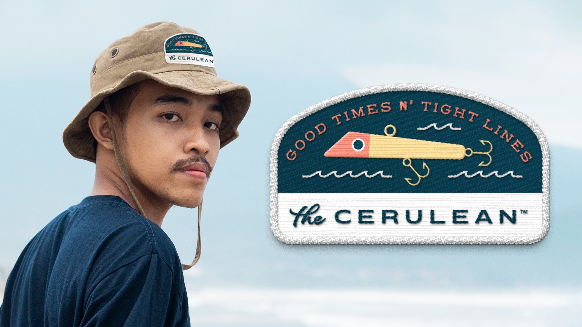
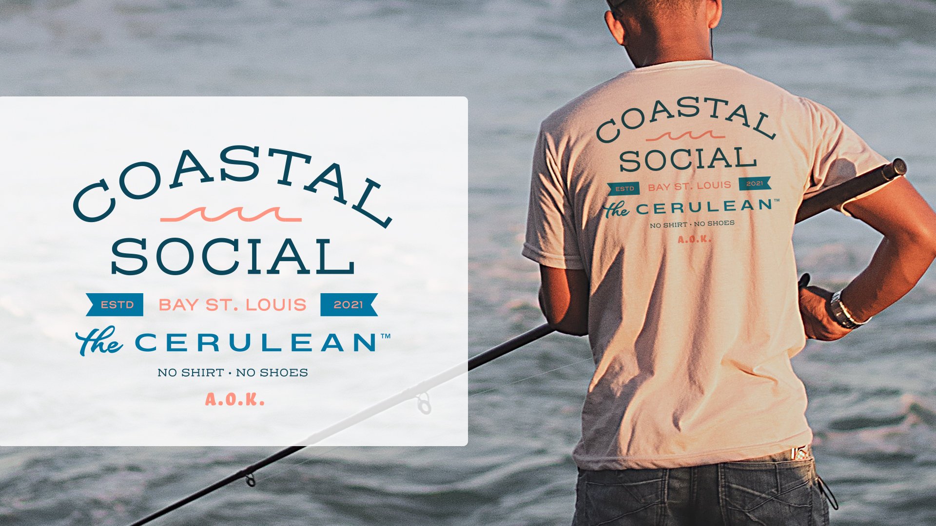
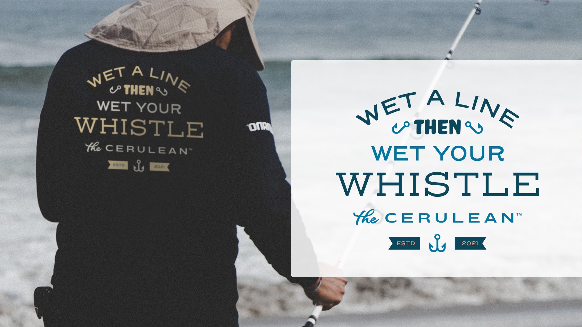
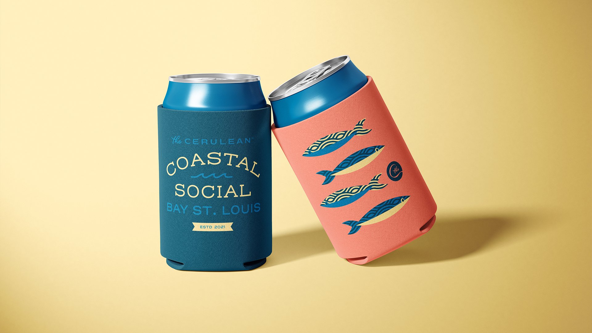
Character pieces have to also make sense for the brand. Yes, in the world of free swag and branded merch, t-shirts and pins are the norm. But just because they are the norm doesn’t mean they’re right for each and every brand. Take the character pieces below for The Cerulean, for example. The Cerulean (while still not open at the time of writing) is a laidback, casual seafood restaurant based out of Bay St. Louis, Mississippi. Bay St. Louis is a touristy waterfront town, but The Cerulean, while wanting to also appeal to tourists, is meant to be a respite for the bay-loving locals.

When coming up with ideas for character pieces, I had to put myself in the shoes of a local; thinking about what kind of items they would actually want to take home and use, and how branded these items should be. Being the more practical sort, I imagined the patron would want items they could actually use; fishing hats and shirts to protect their skin while out on the bay, and koozies to keep their beverage of choice frosty while out in the hot sun.

Project Snippet - Apotheos Coffee Bag

About a year ago I wrote about the early design explorations for Apotheos Roastery’s cold brew coffee cans. I’ve recently published the full case study as well showcasing the final can designs, and some temporary bags that Apotheos was using at the time the photos were taken. Well… it turns out the bags I designed were never meant to be, and they employed another designer to revisit the bags and print them. Which is ok! It happens, I understand. Still a little sad about it but I get it.

So! To honor those bag designs that never got to see the light of day, I want to showcase them in their full glory here in a Project Snippet, and also some of the earlier explorations that lead to the final designs.

This first set of unused designs explores a very modern, clean and maximalist approach to the bags. The oversized golden droplet draws the eye regardless of being on a light or dark background. Ideally the dark bag would have been a dark roast, the light bag would be the light roasts, and a third undetermined color (probably a light purple) would’ve been the medium roast.

This second set of unused designs was inspired by vintage marbled end papers that you’d typically find in old books. The idea was that each bag’s marbled pattern (depending on the kind of roast, the name of the roast, and the tasting notes) would change in form and color to reflect the qualities of the coffee beans inside. You’ll note that the sides of the bags here are all different. I was playing with different typographic layouts, inspired by old book spines, and was undecided on what layout would work best to harken back to the point of inspiration and still ribbonize well across different bags. You’ll see in the next set that the book spine idea made its way to the final coffee bag designs, despite the end paper idea being a little too complicated to bring to life.

The final and approved (but not produced :( ) bags feature some design choices from the previous two iterations. The lighter flood of cream on the face and back of the bag allow the logo and brand to take center stage, while an accent color that designates the SKU is used on sparingly on these planes. That accent floods the sides of the bag, revisiting in the book spine motif from the last direction. A custom icon was also designed for each SKU, representative of the products’ name.