Project Snippet - Bad Beaches Only

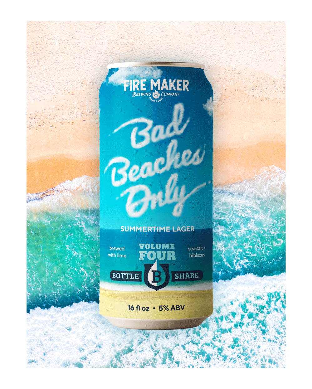
Summer time means one thing; crushing cold ones on the beach. While I don’t have the ability for a summer Florida getaway this year; I can live vicariously through Bad Beaches Only. BBO is a Summertime Lager, the fourth edition made in collaboration with Bottleshare, an Atlanta-based nonprofit helping those in the beverage industry through times of crisis.

Being in North Georgia, most people go to Florida, the Georgia coast, or the Carolinas for their summer vacations. I have fond memories of growing up and going to the beach in South Florida, watching planes slowly passing over the water with banners waving behind them. It was always a treat to get the skywriters, planes that would use water vapor to write out messages in the sky. The design for Bad Beaches Only was inspired by those memories, featuring the beer name in hand-lettered clouds inspired by skywriting. Turning the can reveals the pilot, adding surprise and delight as the customer interacts with the packaging. I couldn’t decide if I liked the daytime or sunset sky best, so I’ve decided to show both.

Bad Beaches Only Beer Can Design.
 
Two colorways for Bad Beaches Only beer can design.
 

Project Snippet — Believe in Beer Can Design

At VIgor, we work with Bottleshare, the craft beer industry’s first emergency fund-focused nonprofit. Bottleshare raises funds for members of the craft beer community facing financial hardship by collaborating with breweries to create special release beers, the sales of which go into their grant program. In April of 2020, Bottleshare was presented with the huge opportunity to partner with the Brewers Association and created the ‘Believe in Beer’ Relief Fund — a fund made specifically to support breweries and state brewers guilds impacted by the coronavirus pandemic. With sponsorship secured and the beer under works by the talented brewmasters at Mobcraft, we were tasked to create a can design that stood out on the shelves and brought attention to the cause.

BelieveInBeer_Can_v2.0.jpg
BelieveInBeer_Can_v2.1.jpg

For my proposed direction, I sought to cut through the visual noise found on the craft beer shelf and get straight to the heart of the matter. Developing the Believe In Beer visual identity further, I designed a clean white can that put the cause front and center. The front of the can was designed on a grid to accomodate any future Believe in Beer releases, their breweries, tasting notes and styles, while maintaining visual consistency. On the back of the can, I wrote a message of hope for the viewer, hoping to pull at their heartstrings and encourage them to learn more about the fund and Bottleshare in general.

Project Snippet — VH Beer Can Designs

A few months ago, I featured an early exploration of what a marketing campaign could look like for a client of Vigor’s, VH Beer. Before we got to that scope of work, however, we had gone through the process of naming, branding, and designing packaging for the brewery. The directions featured below are were early, unused explorations of what can designs for VH Beer could look like.

To see where the final branding and packaging landed, be sure to check out the case study on Vigor’s website.

VHBeer_MockupD1_Slide1.jpg
VHBeer_MockupD1_Slide2.jpg

As this brewery was a new one on the scene in Denver, CO, this direction puts their logo front and center. I also hoped to create differentiation from a lot of the other over-designed colorful craft beer cans on the shelves by using a limited color palette and creating a literal white space for customers to rest their eyes from the rest of the visual noise.

VHBeer_MockupD2_Slide1.jpg
VHBeer_MockupD2_Sslide2.jpg

This direction aimed to depict the literal scenarios a consumer could find themselves in while enjoying VH Beer. Shoutout to Chia-Yu Hsu for helping me out with the illustrations!

VHBeer_MockupD3_Slide1.jpg
VHBeer_MockupD3_Slide2.jpg

VH Beer is run by the same owners of Viewhouse, a local chain of restaurants / bars. Viewhouse’s name carries a bit of weight in Denver, and so I wanted to make the connection between VH Beer and Viewhouse more apparent by focusing on a shared mascot; the Viewhouse eagle. The eagle is anthropomorphized and illustrated in various scenarios, in which they would find themselves enjoying VH Beer. Thanks again to Chia-Yu Hsu for lending his talent in bringing my idea to life.