
• Home
  • Work
  • Services
  • Journal
  • About
  • Contact
Menu

Natalie Suarez

  • Home
  • Work
  • Services
  • Journal
  • About
  • Contact
JournalBanner.gif

Project Snippet - Wild Wild Wings Brand Exploration

June 8, 2024

At Nextbite, the creative team helped bring to life, and inject new life, into many of the virtual kitchen concepts that the start-up owned. One such concept was Wild Wild Wings. They already had a logo (which you can see here), but it was (and still is) boring and expected in the space. One internal branding exercise we did was to re-brand Wild Wild Wings, and create something that spoke to the deliciousness of the offering, while also creating excitement digitally when no brick-and-mortar experience existed.

Below are three brand concepts that I created. Ultimately, a rebrand for Wild Wild Wings didn’t go through, but it’s fun to look back on what could have been right?
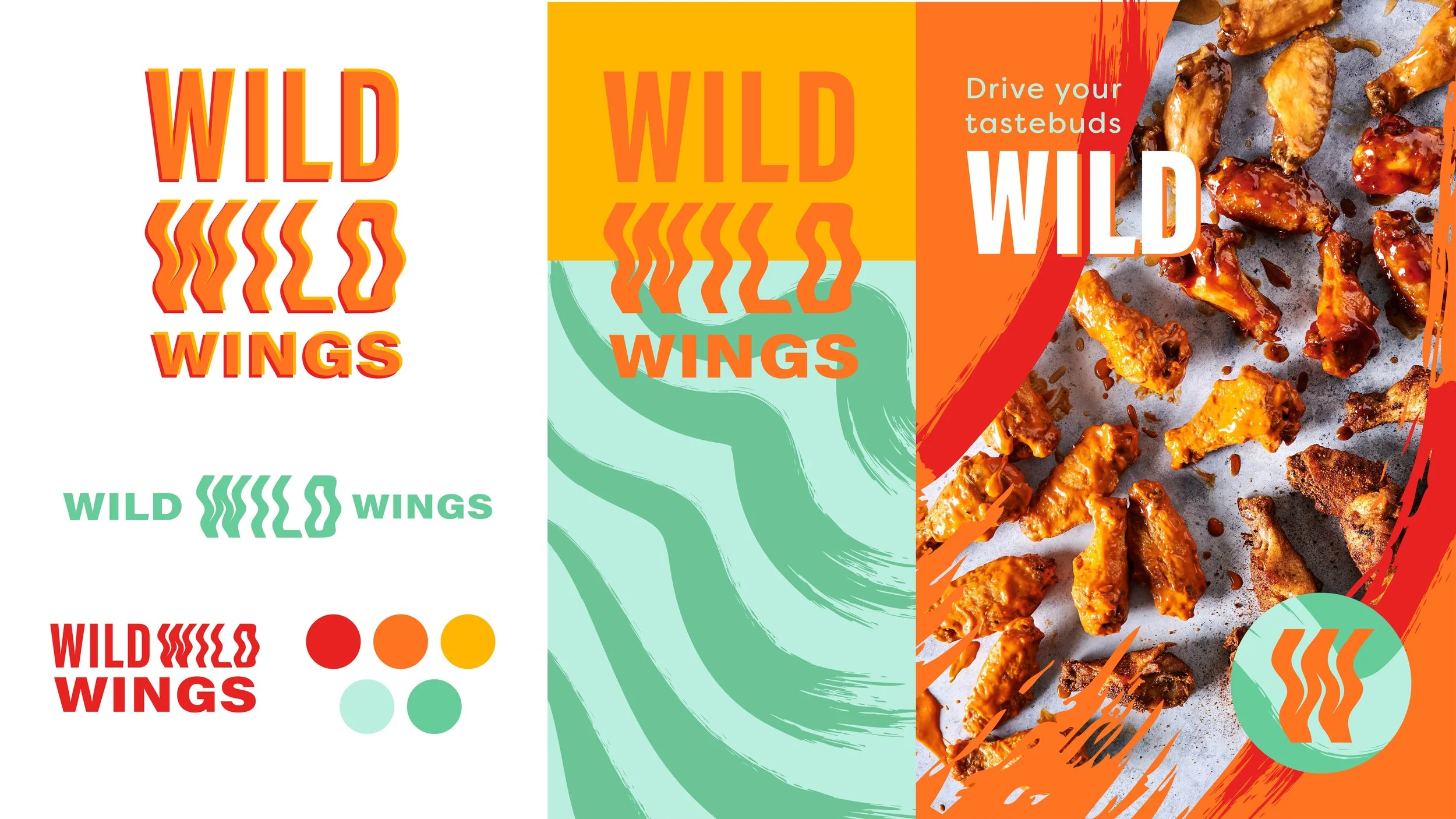
Concept 1

This simple logotype encapsulates the idea of mix-and-match; plain, legible type mixed with heatwave inspired text that could be arranged in a number of ways echoes Wild Wild Wings customization offering. Saucy brushstrokes contrast with the clean edges of the type, and mirror the appetite appeal of the offering. Yellows, oranges and reds make up the lion’s share of wing-brand color palettes, so I wanted to create something that introduced an unexpected, contrasting and attention-grabbing teal.
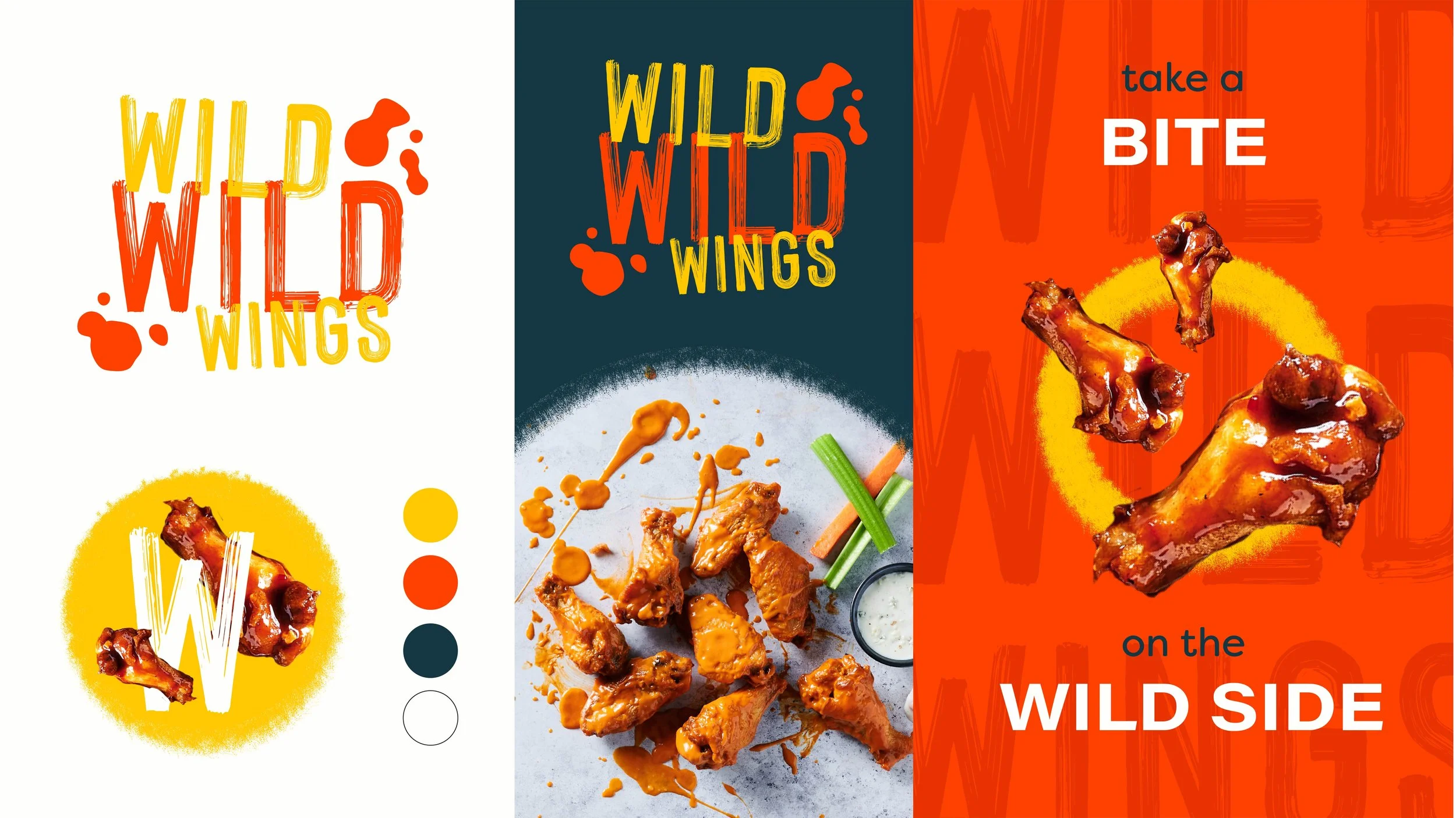
Concept 2

Skewing into more familiar territory, this direction relies on a classic color palette and visual cues to feel sporty and approachable. Saucy typography, textures and platters feels appetizing and relates to the product. Contrasting that with silouetted and playful imagery, this direction feels fresh, new and exciting.
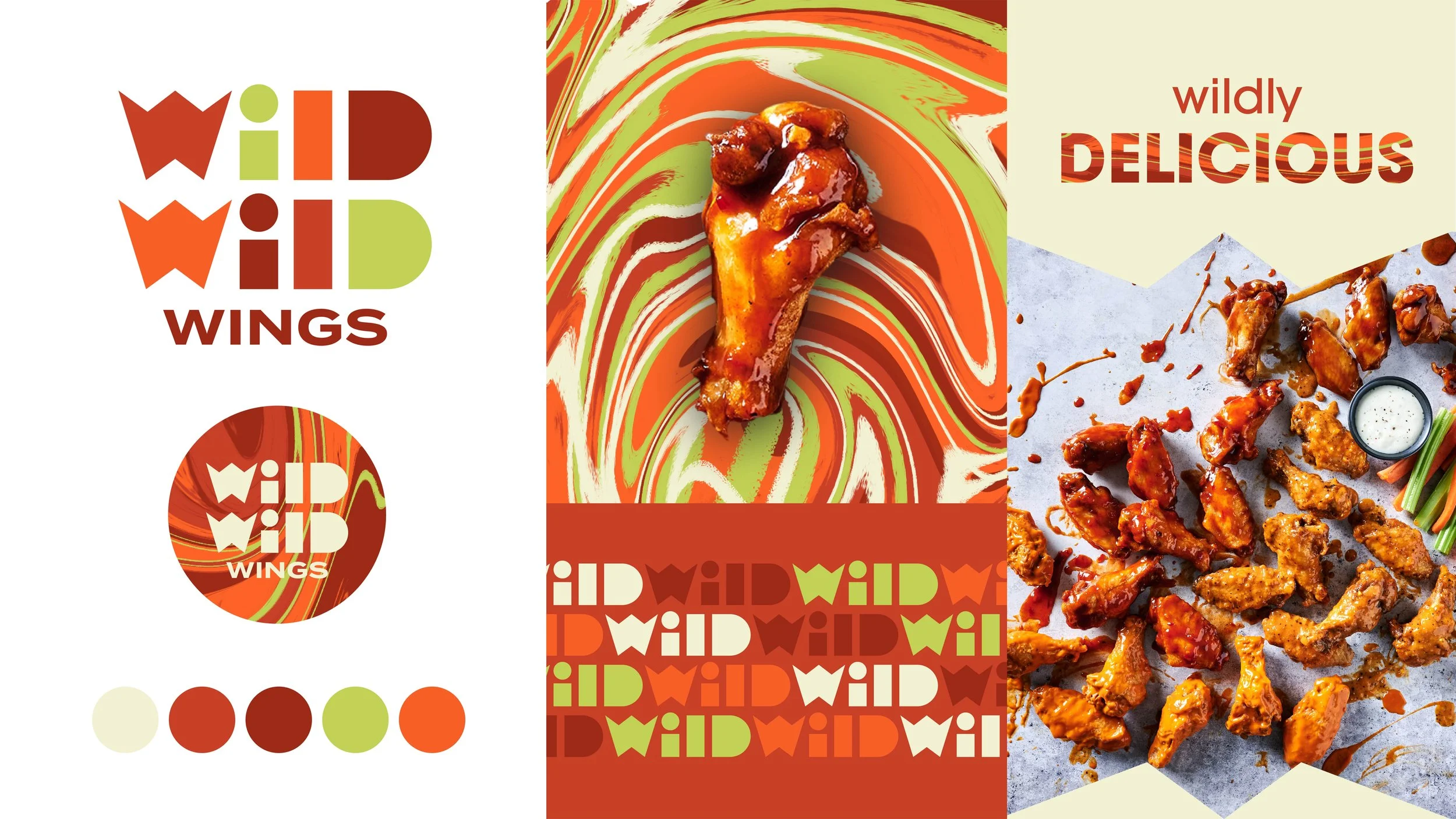
Concept 3

For this direction, I was struck by how the sauce colors, mixed with the off-white of ranch and bright pop of celery green, felt very retro and psychedelic to me. I decided to make a pattern with these colors, mixing them all together as sauces do at the bottom of a plate of wings. To contrast this swirly, funky pattern, I created a custom funky but hard-edged geometric logotype. The shapes of the letters could also be used as masks for imagery, creating a stable, architectural grounding against the melting pattern.

In project snippet Tags brand, brand design, branding, logo, logo design, logotype, pattern, visual identity system, visual identity, food, wings, type, typography
Project Snippet - Crack't Breakfast Sandwiches Visual Identity Exploration →

Latest Posts

Featured
WWWRebrand_v1.3_Page_1.jpg
June 8, 2024
Project Snippet - Wild Wild Wings Brand Exploration
June 8, 2024
Read more →
June 8, 2024
Crackt_NS_v1.1_Page_1.jpg
April 21, 2024
Project Snippet - Crack't Breakfast Sandwiches Visual Identity Exploration
April 21, 2024
Read more →
April 21, 2024
Project Snippet - NextBite Brand Exploration
October 26, 2023
Project Snippet - NextBite Brand Exploration
October 26, 2023
Read more →
October 26, 2023
HopeRoadVis.jpg
July 26, 2023
Project Snippet - Hope Road Cafe
July 26, 2023
Read more →
July 26, 2023
BBO_DoubleBottleMock.jpg
July 10, 2023
Project Snippet - Bad Beaches Only
July 10, 2023
Read more →
July 10, 2023
TheCerulean_VIS_NS_v1.0.jpg
August 19, 2022
Project Snippet - Unused Brand Direction for The Cerulean
August 19, 2022
Read more →
August 19, 2022
TheCerulean_HatandPatch.jpg
July 20, 2022
Project Snippet - Character Pieces for The Cerulean
July 20, 2022
Read more →
July 20, 2022
HEHG_ChasinTails_D1_v1.0.jpg
July 6, 2022
Project Snippet - Chasin' Tails
July 6, 2022
Read more →
July 6, 2022
MangoTango_2.jpg
February 22, 2022
Project Snippet - eegee's Flavor of the Month LTOs
February 22, 2022
Read more →
February 22, 2022
SCRA_LittleFish_NS_v1.3.jpg
February 16, 2022
Project Snippet - Little Fish Sushi Houses
February 16, 2022
Read more →
February 16, 2022
Highline_DR_1.jpg
February 6, 2022
Project Snippet - Highline Burgers + Wings
February 6, 2022
Read more →
February 6, 2022
EDPG_CoffeeBagMock_v1.1 3.jpg
December 21, 2021
Project Snippet - Apotheos Coffee Bag
December 21, 2021
Read more →
December 21, 2021
July 10, 2021
Of Note — Spring (and half of Summer) 2021
July 10, 2021

Ok so it’s summer now, which means I’m pretty behind on this. I started a new job in April and have been focused on that transition, so maintaining my ~ * personal brand * ~ has taken a back seat to that. But! Now that I feel like I’ve got a good grip on my new position and taken some much-needed R&R, I’m ready to jump back in the saddle!

Read more →
July 10, 2021
VDCO_Poster_v1.0.jpg
March 7, 2021
Project Snippet - Virginia Distillery Co Hero Image
March 7, 2021
Read more →
March 7, 2021
March 1, 2021
Of Note — Winter 2020 & 2021
March 1, 2021

And just like that, Winter has come and gone. Mostly. Hell, who am I kidding, that was the longest winter of my life. And there’s still 21 days of it left, but there’s a little bit of hope in the narrow sunbeams that come through my one apartment window. It’ll soon be a year since my husband and I have been working from home, over a year since I’ve been home to see my family, and almost a year since we’ve all started living through a pandemic. Good riddance, winter.

Read more →
March 1, 2021

Powered by Squarespace