Nextbite is a tech company that creates and licenses virtual kitchen brands to brick-and-morter restaurants to increase their third-party delivery revenue. In laymen’s terms; they create ghost kitchens. During my tenure at Nextbite, the creative team was tasked with evolving the brand, developing a new visual identity system that appealed both to restaurant owners and their consumers alike. Below are some of my creative exercises for this project.

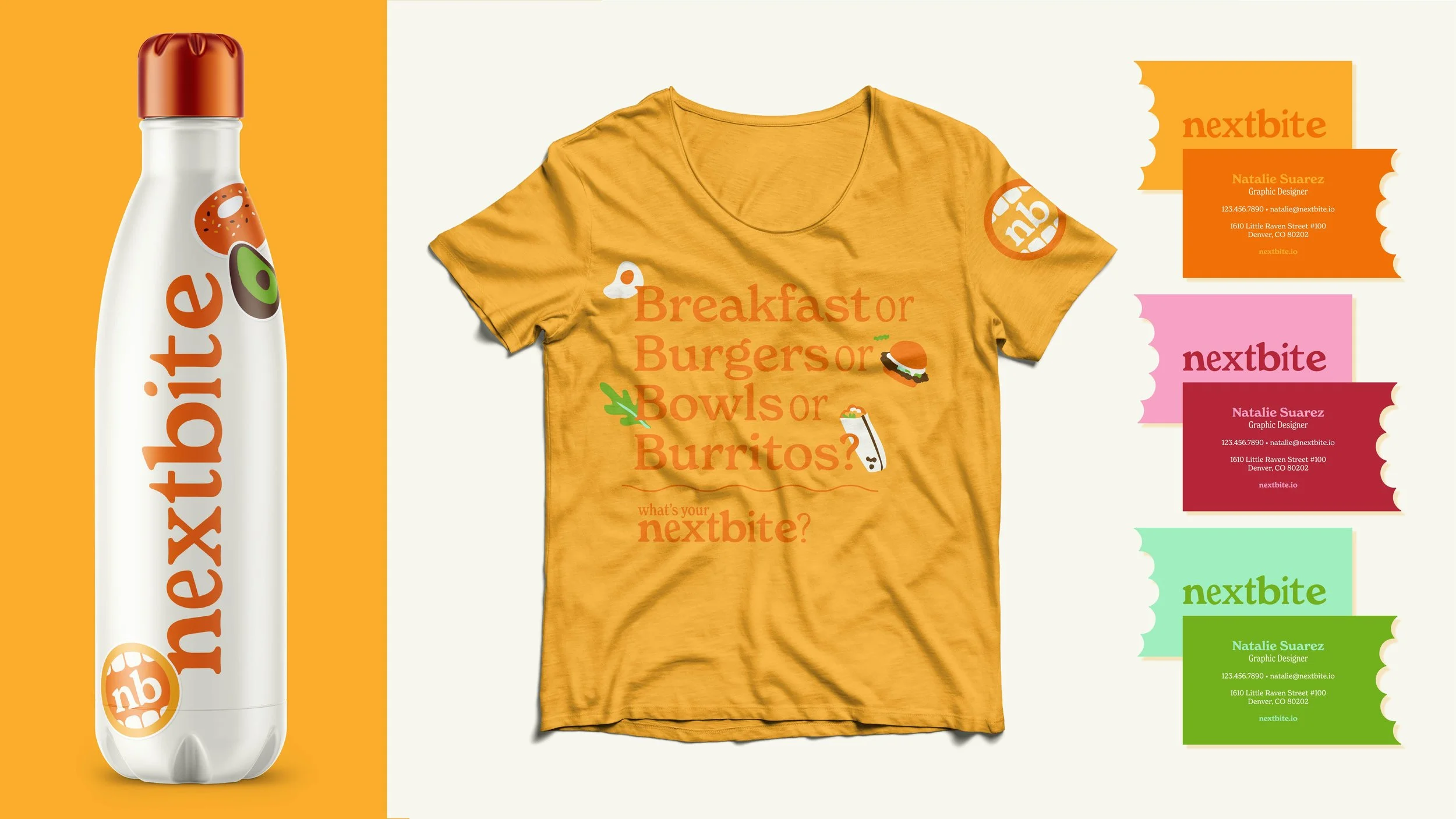
I decided to evolve Nextbite’s original orange to be brighter and more appetizing. Instead of the original geometric sans-serif, I instead played with different weights of a slab serif for the logotype. This style of typography is noticeably absent among tech companies, and feels warmer and more human-centered than other tech companies in the virtual kitchen space. Combining different weights of the same font family speaks to the different virtual kitchen brands living under the Nextbite brand; many different pieces coming together to create a larger whole.
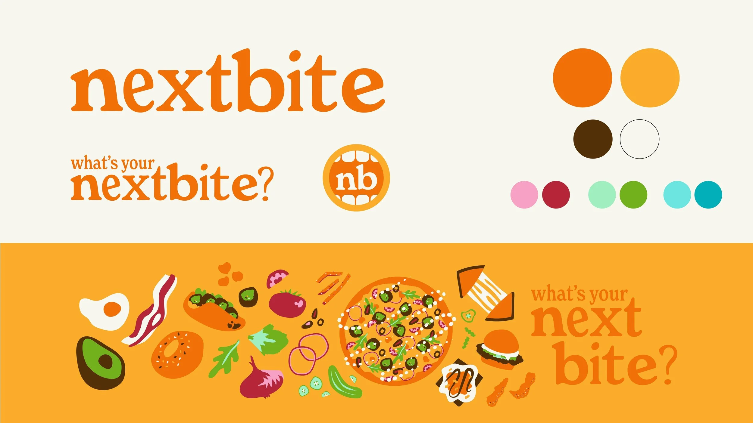
Expanding on the system included developing a tagline lockup, an avatar, colors, and illustrations. The avatar features a fun, cartoonish mouth. The colors were selected to create a limited, but flexible, palette. I focused on colors that bring energy and appetite appeal to illustrations and brand touchpoints. The illustrations are highly stylized, borrowing visual queues from the rounded soft serifs of the logotype. Playful and friendly, the illustrations speak to the breadth of cuisines found under Nextbite’s parent brand, uniting them under one stylistic umbrella.