

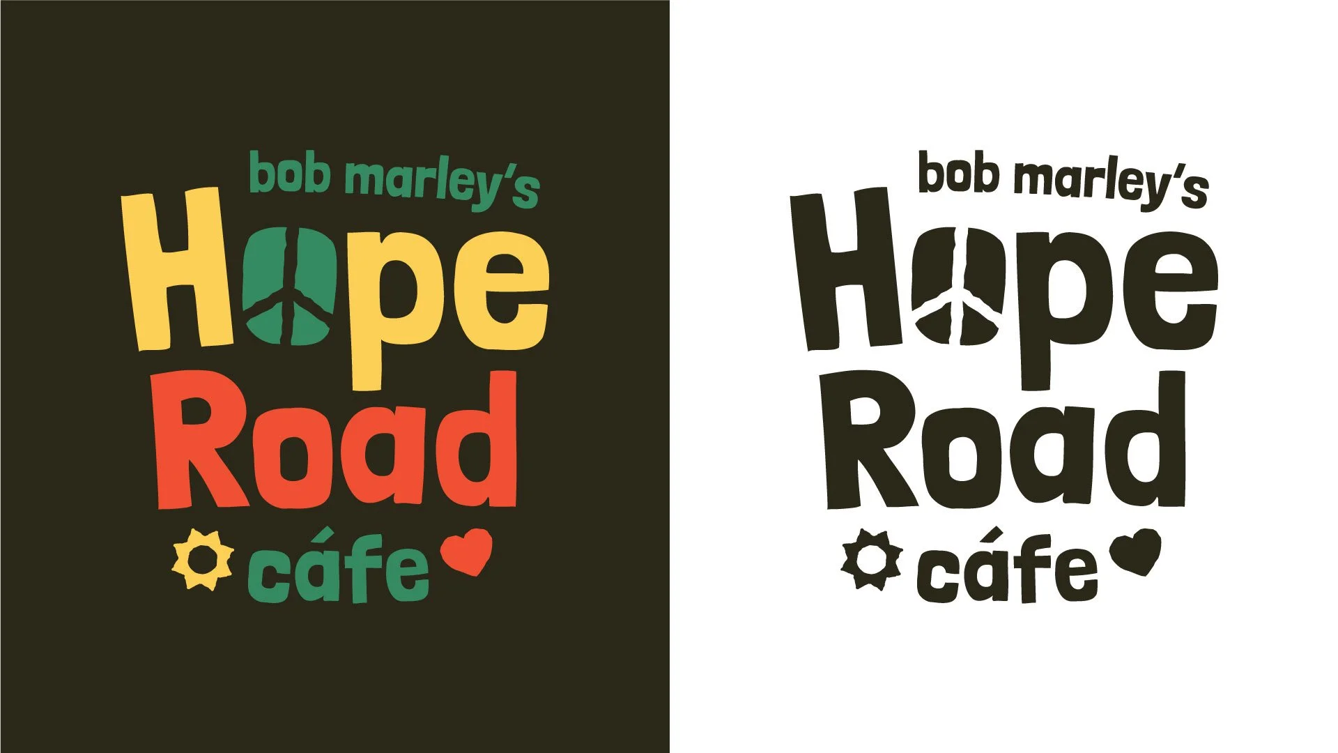
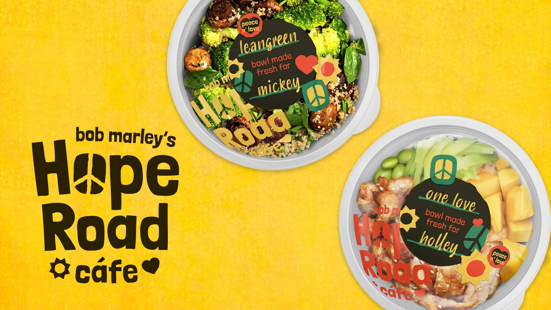
At Nextbite, we often partnered with other restaurant companies to help them break into the virtual kitchen space. As part of the pitch process for these potential partnerships, part of my role was exploring what that partnership could look like as a virtual kitchen brand. One such potential partnership was with the Bob Marley House. Below are is a visual exploration for Hope Road Cafe, a concept for a bowl-based virtual kitchen.

Project Snippet - Apotheos Coffee Bag
About a year ago I wrote about the early design explorations for Apotheos Roastery’s cold brew coffee cans. I’ve recently published the full case study as well showcasing the final can designs, and some temporary bags that Apotheos was using at the time the photos were taken. Well… it turns out the bags I designed were never meant to be, and they employed another designer to revisit the bags and print them. Which is ok! It happens, I understand. Still a little sad about it but I get it.
So! To honor those bag designs that never got to see the light of day, I want to showcase them in their full glory here in a Project Snippet, and also some of the earlier explorations that lead to the final designs.
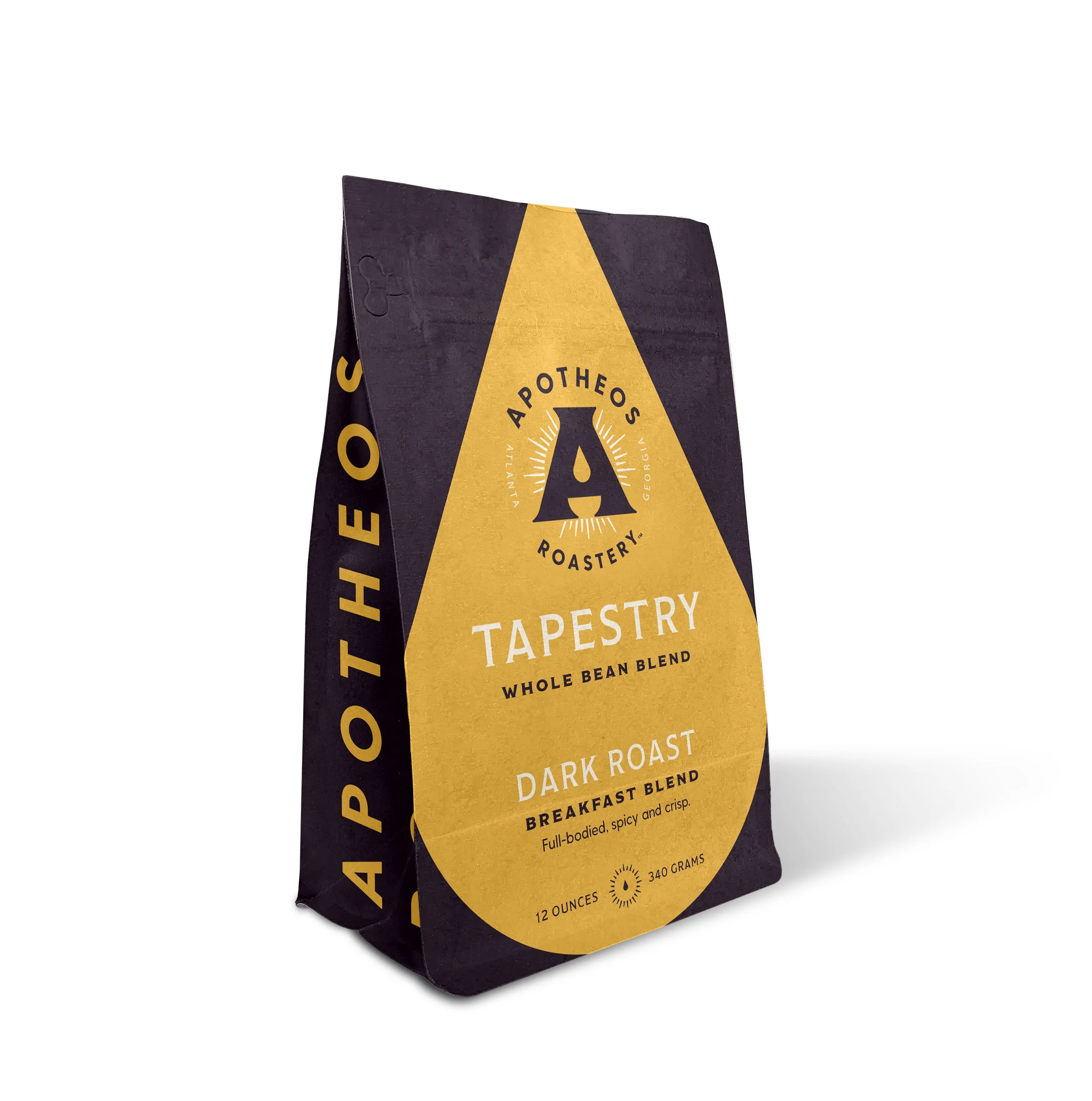
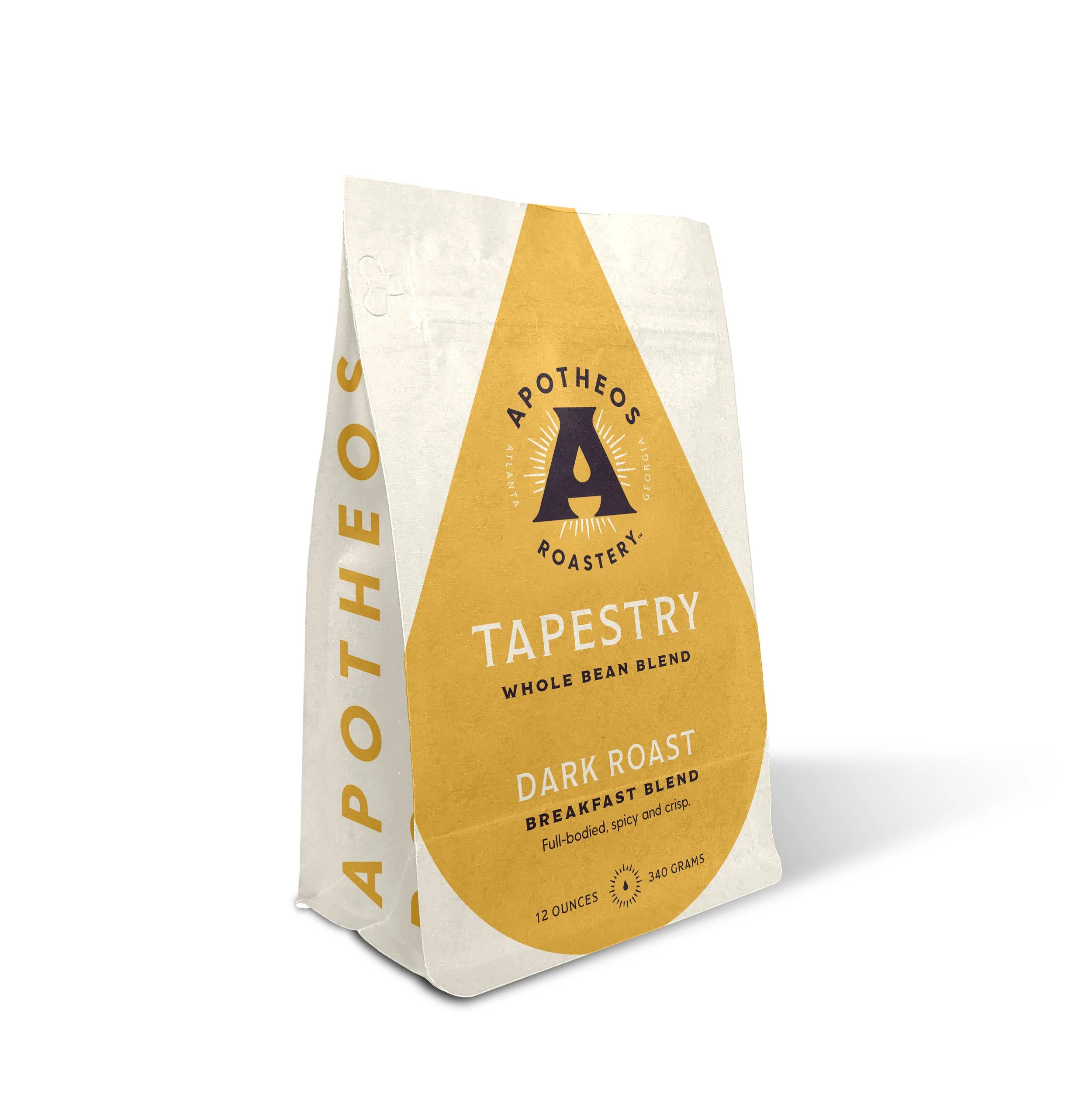
This first set of unused designs explores a very modern, clean and maximalist approach to the bags. The oversized golden droplet draws the eye regardless of being on a light or dark background. Ideally the dark bag would have been a dark roast, the light bag would be the light roasts, and a third undetermined color (probably a light purple) would’ve been the medium roast.


This second set of unused designs was inspired by vintage marbled end papers that you’d typically find in old books. The idea was that each bag’s marbled pattern (depending on the kind of roast, the name of the roast, and the tasting notes) would change in form and color to reflect the qualities of the coffee beans inside. You’ll note that the sides of the bags here are all different. I was playing with different typographic layouts, inspired by old book spines, and was undecided on what layout would work best to harken back to the point of inspiration and still ribbonize well across different bags. You’ll see in the next set that the book spine idea made its way to the final coffee bag designs, despite the end paper idea being a little too complicated to bring to life.


The final and approved (but not produced :( ) bags feature some design choices from the previous two iterations. The lighter flood of cream on the face and back of the bag allow the logo and brand to take center stage, while an accent color that designates the SKU is used on sparingly on these planes. That accent floods the sides of the bag, revisiting in the book spine motif from the last direction. A custom icon was also designed for each SKU, representative of the products’ name.
Project Snippet — Believe in Beer Can Design
At VIgor, we work with Bottleshare, the craft beer industry’s first emergency fund-focused nonprofit. Bottleshare raises funds for members of the craft beer community facing financial hardship by collaborating with breweries to create special release beers, the sales of which go into their grant program. In April of 2020, Bottleshare was presented with the huge opportunity to partner with the Brewers Association and created the ‘Believe in Beer’ Relief Fund — a fund made specifically to support breweries and state brewers guilds impacted by the coronavirus pandemic. With sponsorship secured and the beer under works by the talented brewmasters at Mobcraft, we were tasked to create a can design that stood out on the shelves and brought attention to the cause.
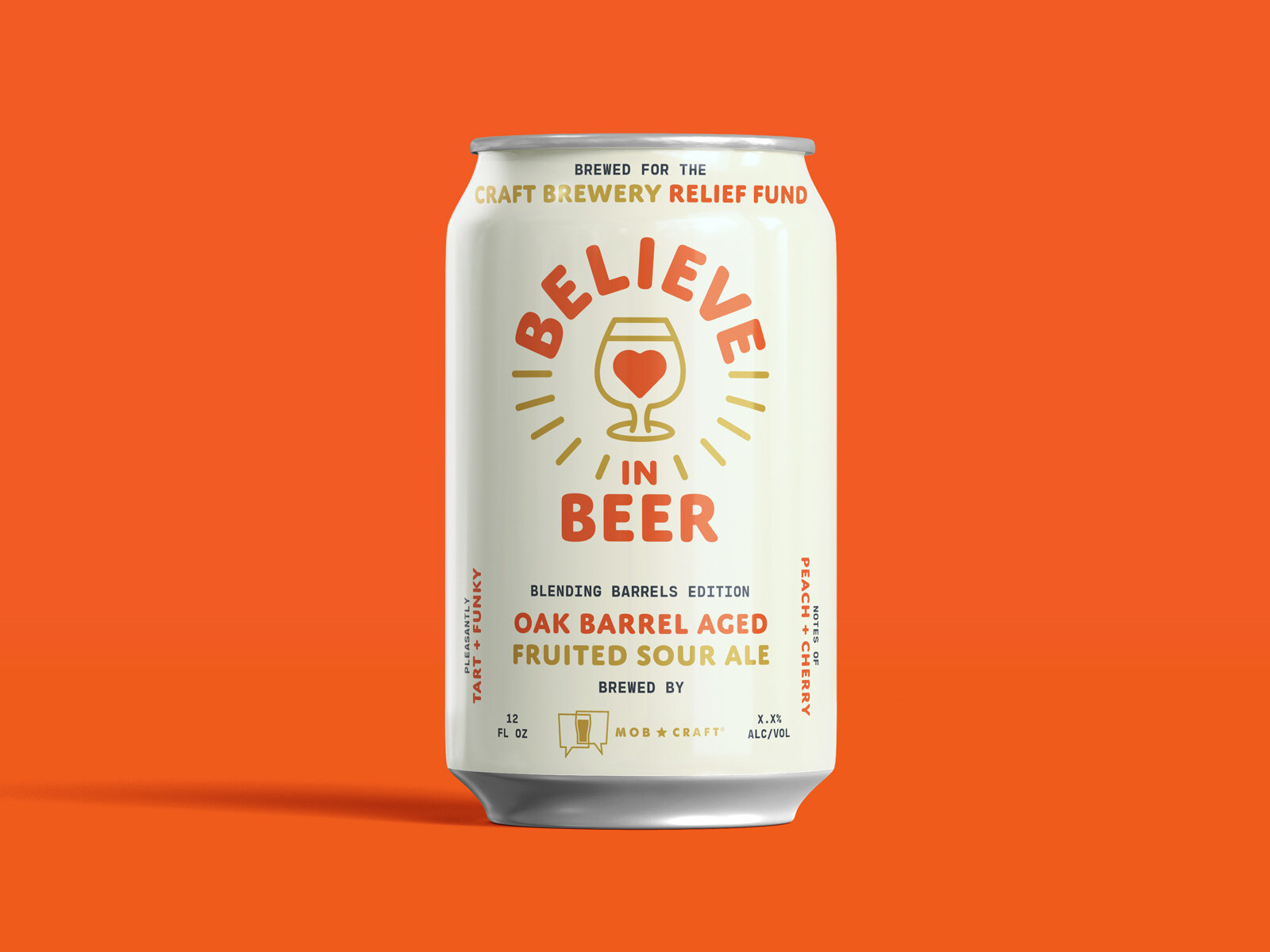

For my proposed direction, I sought to cut through the visual noise found on the craft beer shelf and get straight to the heart of the matter. Developing the Believe In Beer visual identity further, I designed a clean white can that put the cause front and center. The front of the can was designed on a grid to accomodate any future Believe in Beer releases, their breweries, tasting notes and styles, while maintaining visual consistency. On the back of the can, I wrote a message of hope for the viewer, hoping to pull at their heartstrings and encourage them to learn more about the fund and Bottleshare in general.
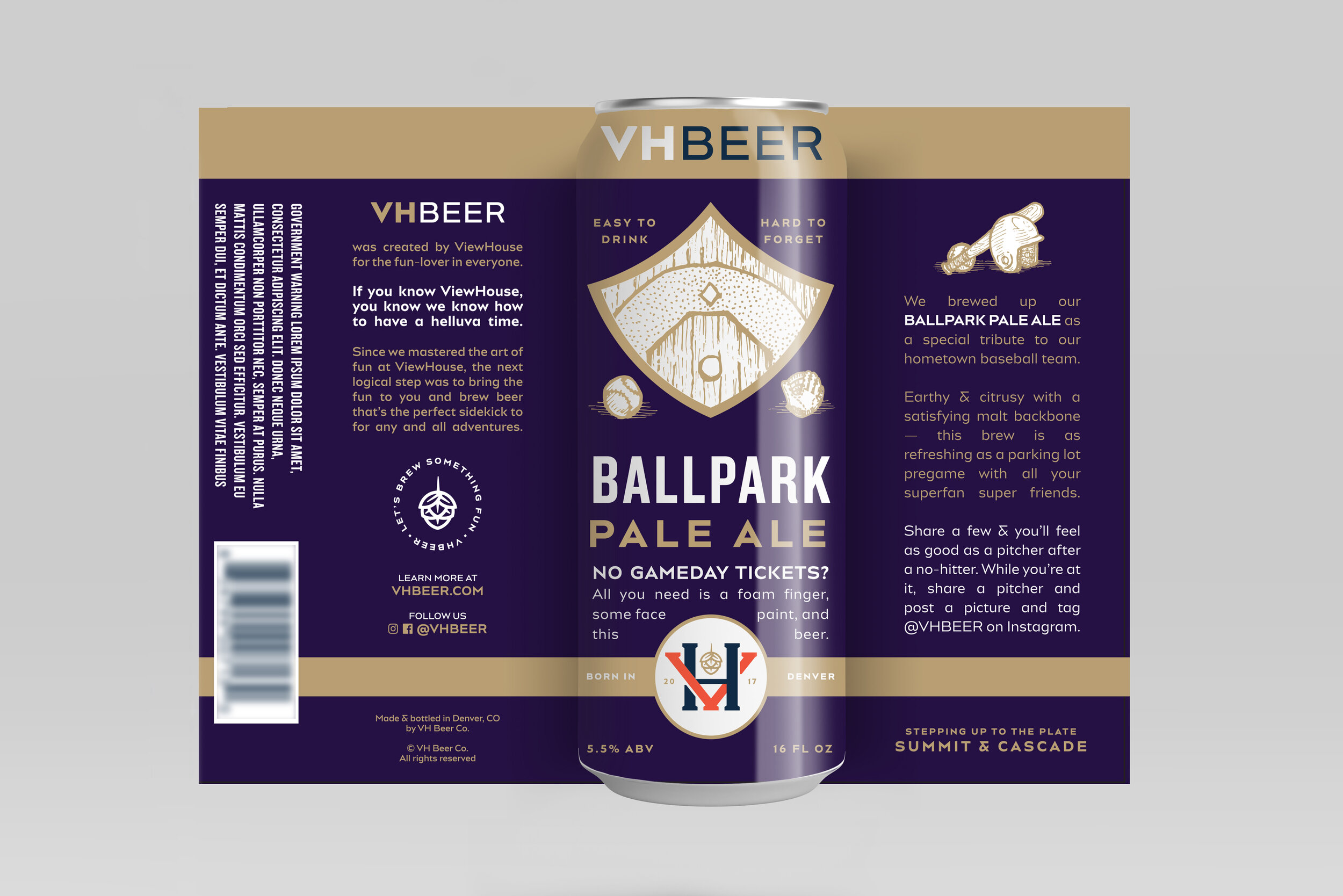
Project Snippet — VH Beer Can Designs
A few months ago, I featured an early exploration of what a marketing campaign could look like for a client of Vigor’s, VH Beer. Before we got to that scope of work, however, we had gone through the process of naming, branding, and designing packaging for the brewery. The directions featured below are were early, unused explorations of what can designs for VH Beer could look like.
To see where the final branding and packaging landed, be sure to check out the case study on Vigor’s website.
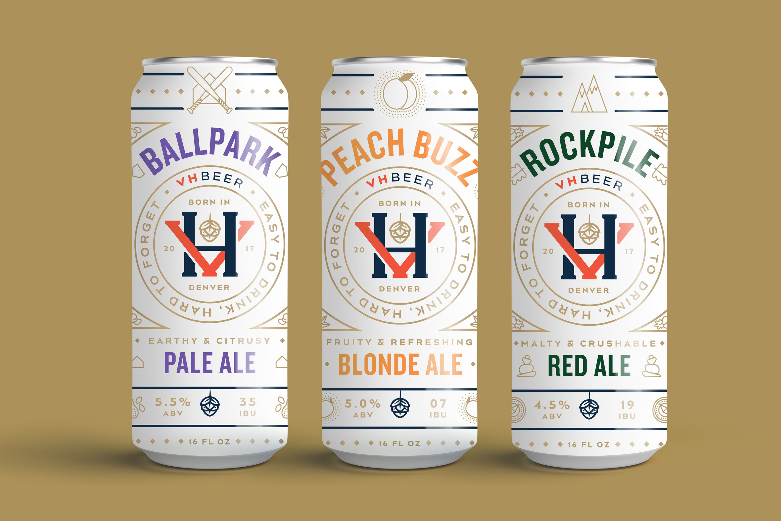

As this brewery was a new one on the scene in Denver, CO, this direction puts their logo front and center. I also hoped to create differentiation from a lot of the other over-designed colorful craft beer cans on the shelves by using a limited color palette and creating a literal white space for customers to rest their eyes from the rest of the visual noise.

This direction aimed to depict the literal scenarios a consumer could find themselves in while enjoying VH Beer. Shoutout to Chia-Yu Hsu for helping me out with the illustrations!


VH Beer is run by the same owners of Viewhouse, a local chain of restaurants / bars. Viewhouse’s name carries a bit of weight in Denver, and so I wanted to make the connection between VH Beer and Viewhouse more apparent by focusing on a shared mascot; the Viewhouse eagle. The eagle is anthropomorphized and illustrated in various scenarios, in which they would find themselves enjoying VH Beer. Thanks again to Chia-Yu Hsu for lending his talent in bringing my idea to life.
Project Snippet — Apotheos Cold Brew Can Packaging Design
Apotheos Roastery has been a client at Vigor for over a year now. It started out as an independent, single-location coffee roastery with big dreams of nationally distributing their cold brew coffee. Over the course of that year, things changed, and now Apotheos, in addition to their main roastery in Kennesaw, will be taking over a chain of a well-known local coffee shops here in Atlanta. As we reach the end of the project and soon Apotheos Roastery will make their brand-debut and be open to the public, I wanted to share some designs that ended up on the cutting room floor. First up, a few unused directions for their canned cold brew.
All these designs feature the same names for the coffee flavors that we came up with at Vigor. As Apotheos is meant to be a community-centric brand, we decided to name each flavor after different personalities that may wander into the roastery. Adventurer, for those coffee drinkers with an adventurous palette, features notes of chocolate, pecan, salt and a touch of cayenne. Maverick, for those who need an extra kick while building their side hustle, is an extra intense double-black cold brew. And Purist, for those who like things plain and simple, is the flagship flavor with no frills. These names carried through to the final can designs, as did some of the iconography developed below.

This first look, and the second for that matter, both blowout Apotheo’s A monogram, putting the cup and droplet hidden in the letters’ negative space front and center while using it as a framing device. You can see the use of the A more clearly in the expanded label view, below. The A in this direction served as a window, peeking into the life of the persona it’s named after.


This second direction is a simplified approach of the first, removing the background imagery and incorporating a gradient for a cleaner, sleeker look. A different framing device was tried on the can’s front to contain the full primary logo that Vigor developed for the brand, but eventually this approach was scrapped completely for a look that shined a brighter light on the brand.


This last direction tried something completely different, focusing fully on duo-toned, abstract imagery to capture the essence of each coffee flavor. Running type vertically down the can created an edgy, contemporary look, and paired with the other type and logo, creating a framing device for the focal point of each can’s image.
I was lucky enough to be able to work on these cans, and other packaging elements for Apotheos Roastery, all the way through to production. Eventually, I’ll link to the full case study once it’s developed, but for now, you can catch a peek at some of the other elements developed for Apotheos Roastery on their Instagram.