

A few months ago, I featured an early exploration of what a marketing campaign could look like for a client of Vigor’s, VH Beer. Before we got to that scope of work, however, we had gone through the process of naming, branding, and designing packaging for the brewery. The directions featured below are were early, unused explorations of what can designs for VH Beer could look like.
To see where the final branding and packaging landed, be sure to check out the case study on Vigor’s website.
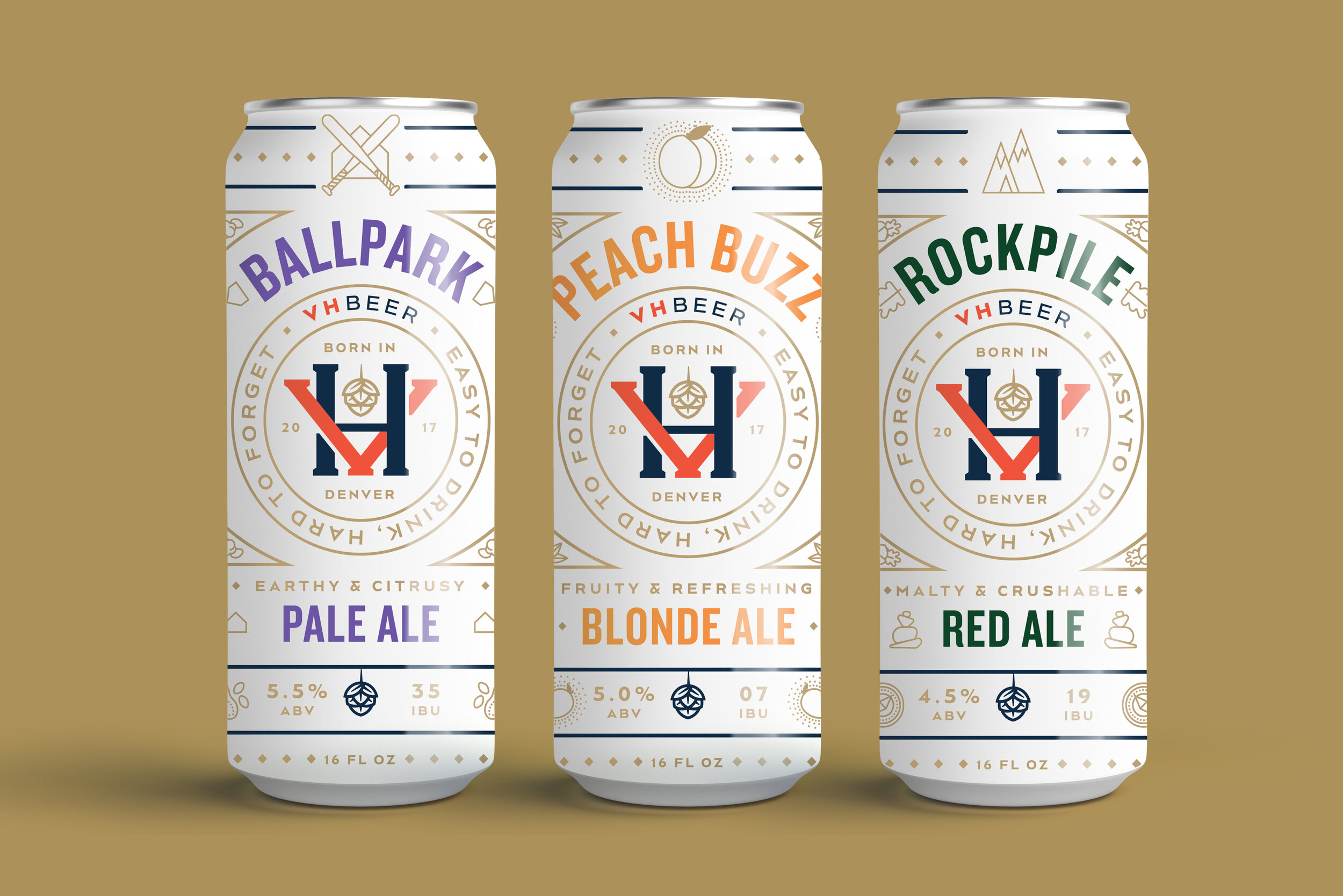

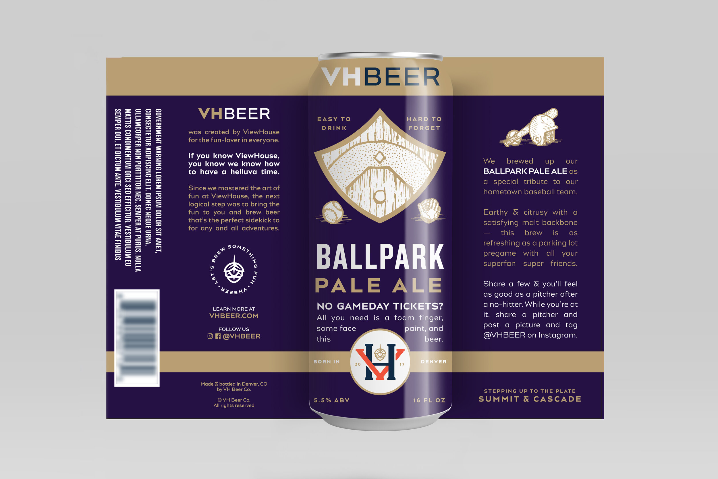
As this brewery was a new one on the scene in Denver, CO, this direction puts their logo front and center. I also hoped to create differentiation from a lot of the other over-designed colorful craft beer cans on the shelves by using a limited color palette and creating a literal white space for customers to rest their eyes from the rest of the visual noise.

This direction aimed to depict the literal scenarios a consumer could find themselves in while enjoying VH Beer. Shoutout to Chia-Yu Hsu for helping me out with the illustrations!


VH Beer is run by the same owners of Viewhouse, a local chain of restaurants / bars. Viewhouse’s name carries a bit of weight in Denver, and so I wanted to make the connection between VH Beer and Viewhouse more apparent by focusing on a shared mascot; the Viewhouse eagle. The eagle is anthropomorphized and illustrated in various scenarios, in which they would find themselves enjoying VH Beer. Thanks again to Chia-Yu Hsu for lending his talent in bringing my idea to life.