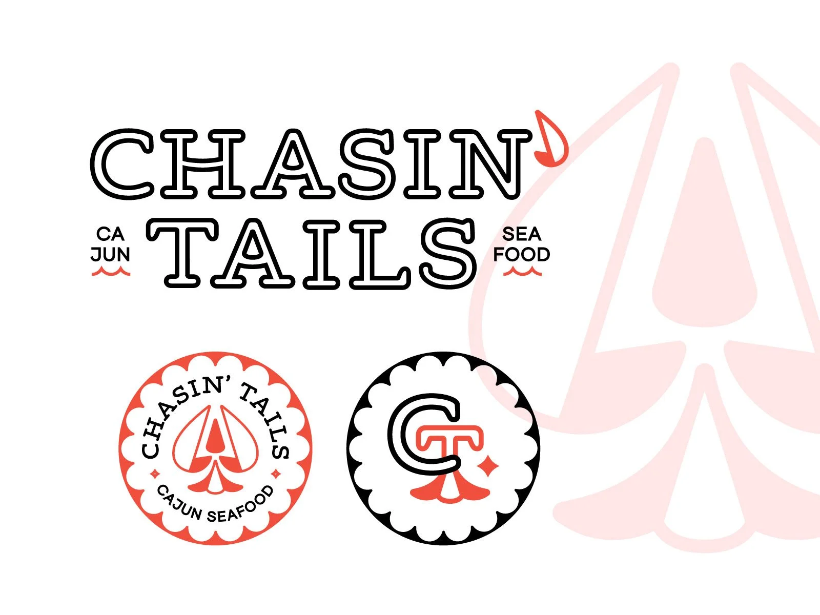
Back in the day there were some real interesting clients that came through the doors at Vigor. One such client was Happy Endings Hospitality (HEH for short… you may giggle now). They own a few different restaurants, each of them with a suggestive name. Chasin’ Tails is one such restaurant, their Cajun concept, and the OG concept paved the way for the rest of HEH’s brands.
So you may be asking yourself, looking at the logo and supporting marks above… why poker chips? Why have you abstracted a crawfish into a spade? Well, dear reader, it’s because without poker chips Happy Endings Hospitality wouldn’t exist. The founder likes to take risks and have fun, as is obvious by the risque names of the restaurants they own, and initially started HEH with money he had one from time spent in Vegas. So, to pay homage to that story and set Chasin’ Tails apart from other seafood restaurants, I focused on a clean-lined look that would layer easily with gratuitous photos of low-country boils and stand-out among the nautical ship-lap-covered competition.
This little identity system didn’t end up being the final, but I felt there was merit in it and couldn’t let it gather dust on my harddrive.


