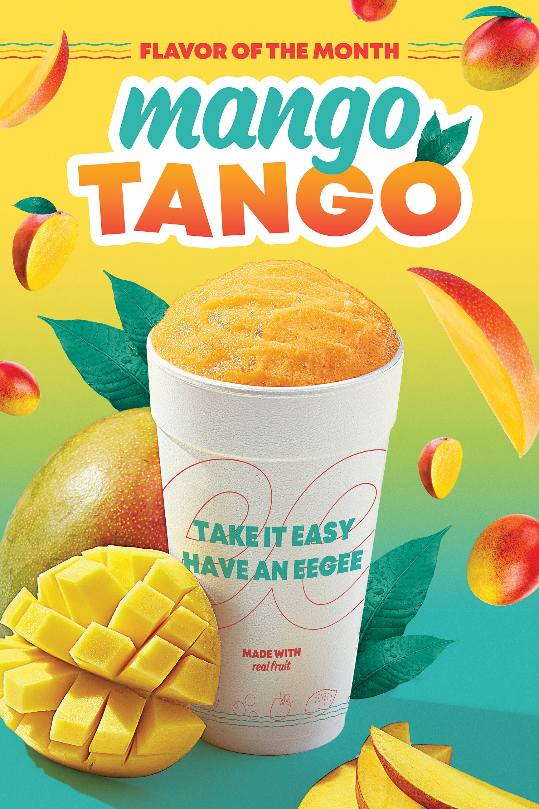
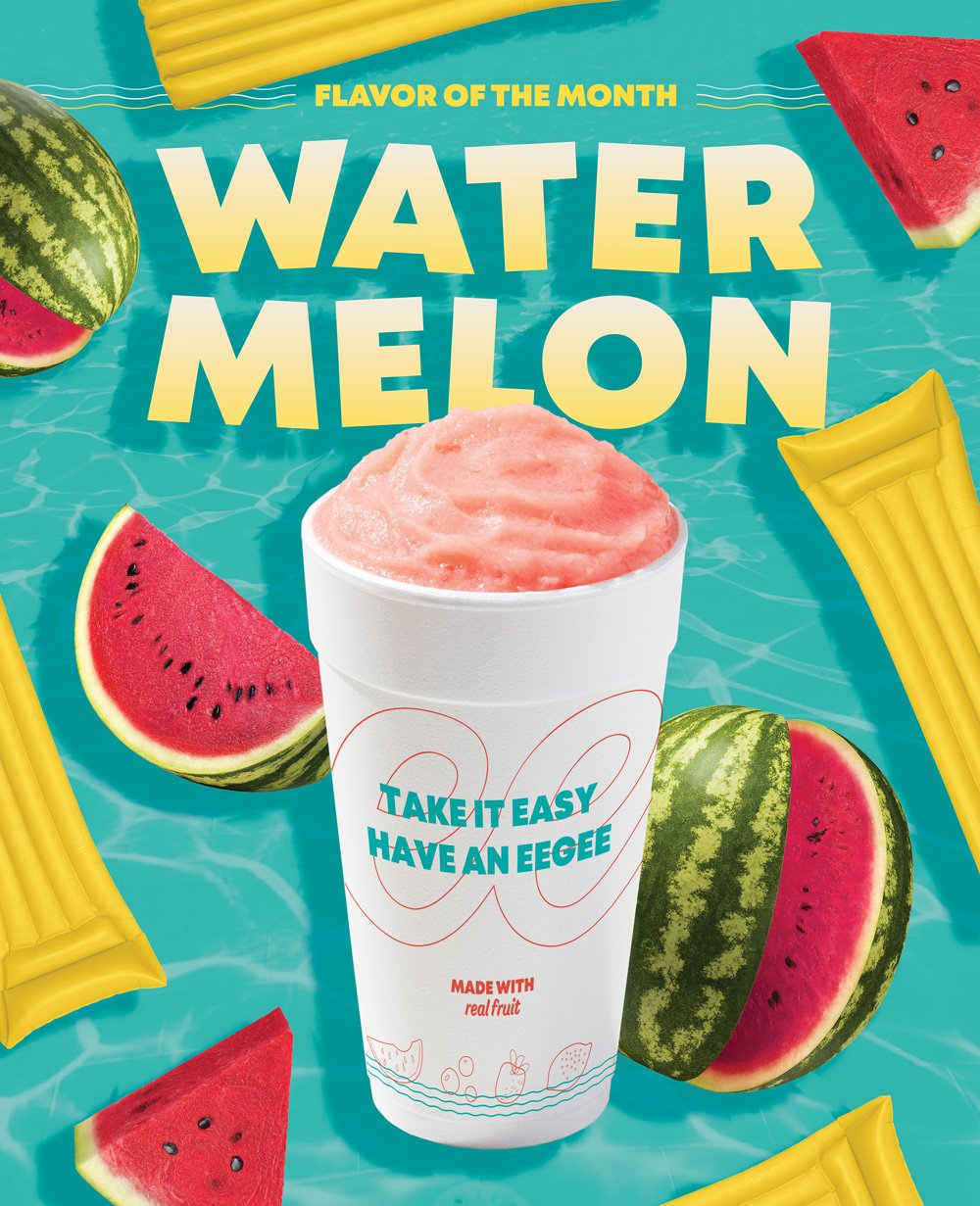
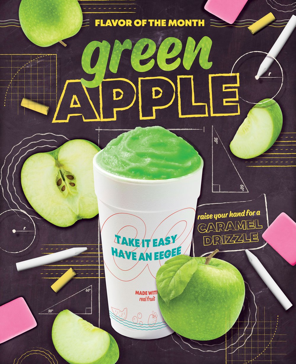
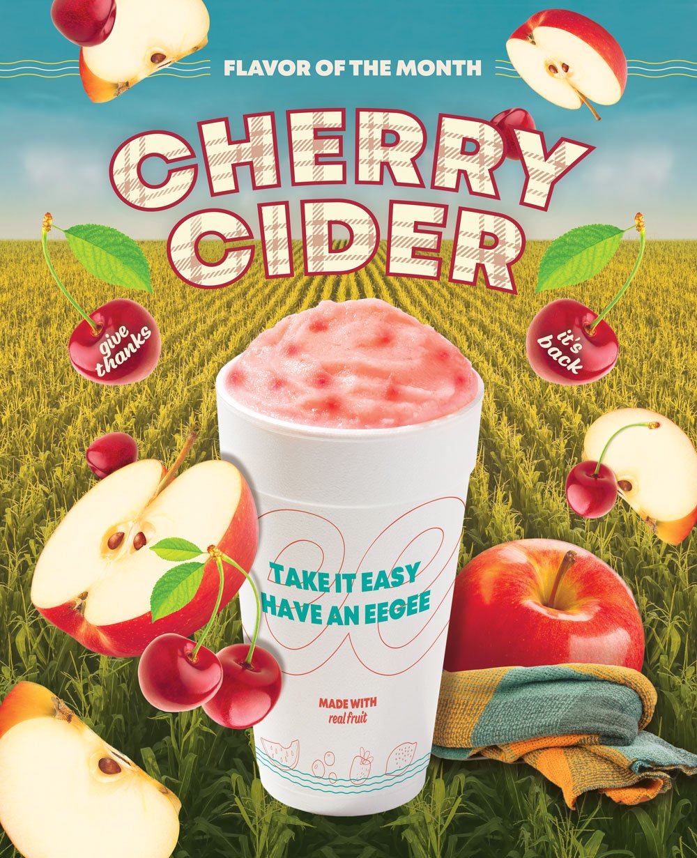
Two eegee’s case studies, an eegee’s project snippet… another eegee’s project snippet? Jeez, how much work did I do for eegee’s? Apparently, a lot. I’ve still got another project snippet after this one to showcase even more work.
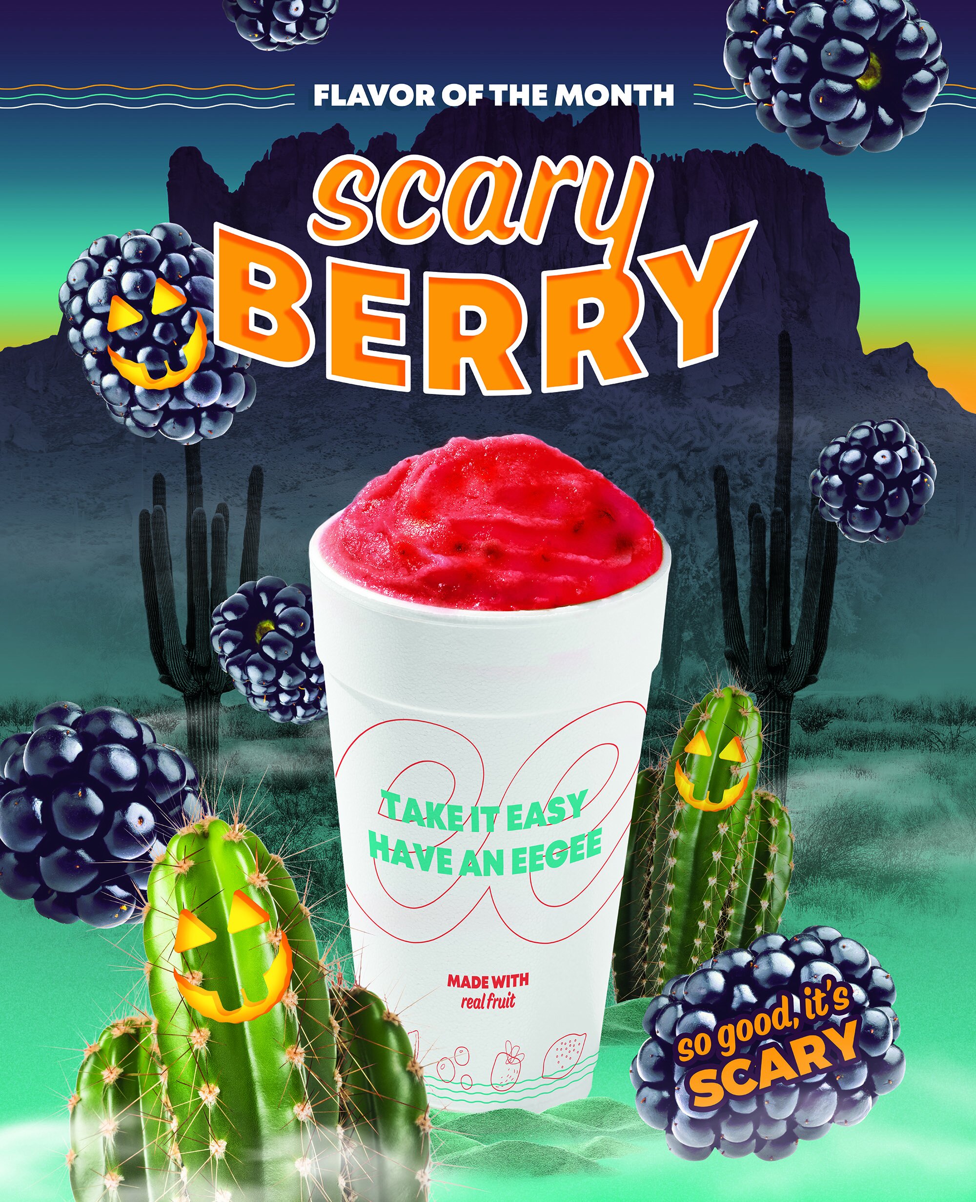
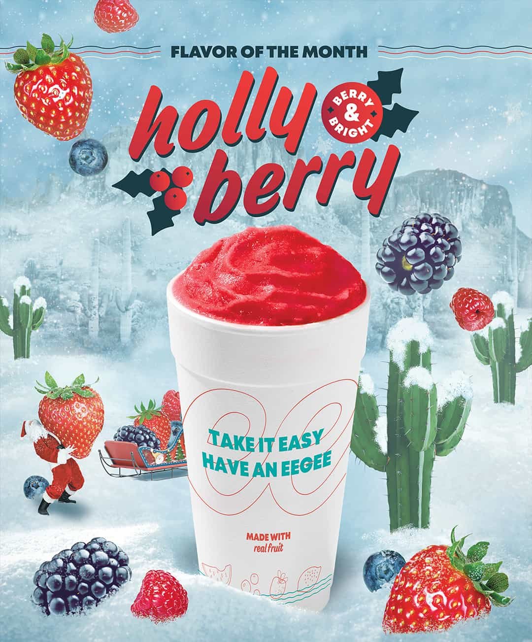
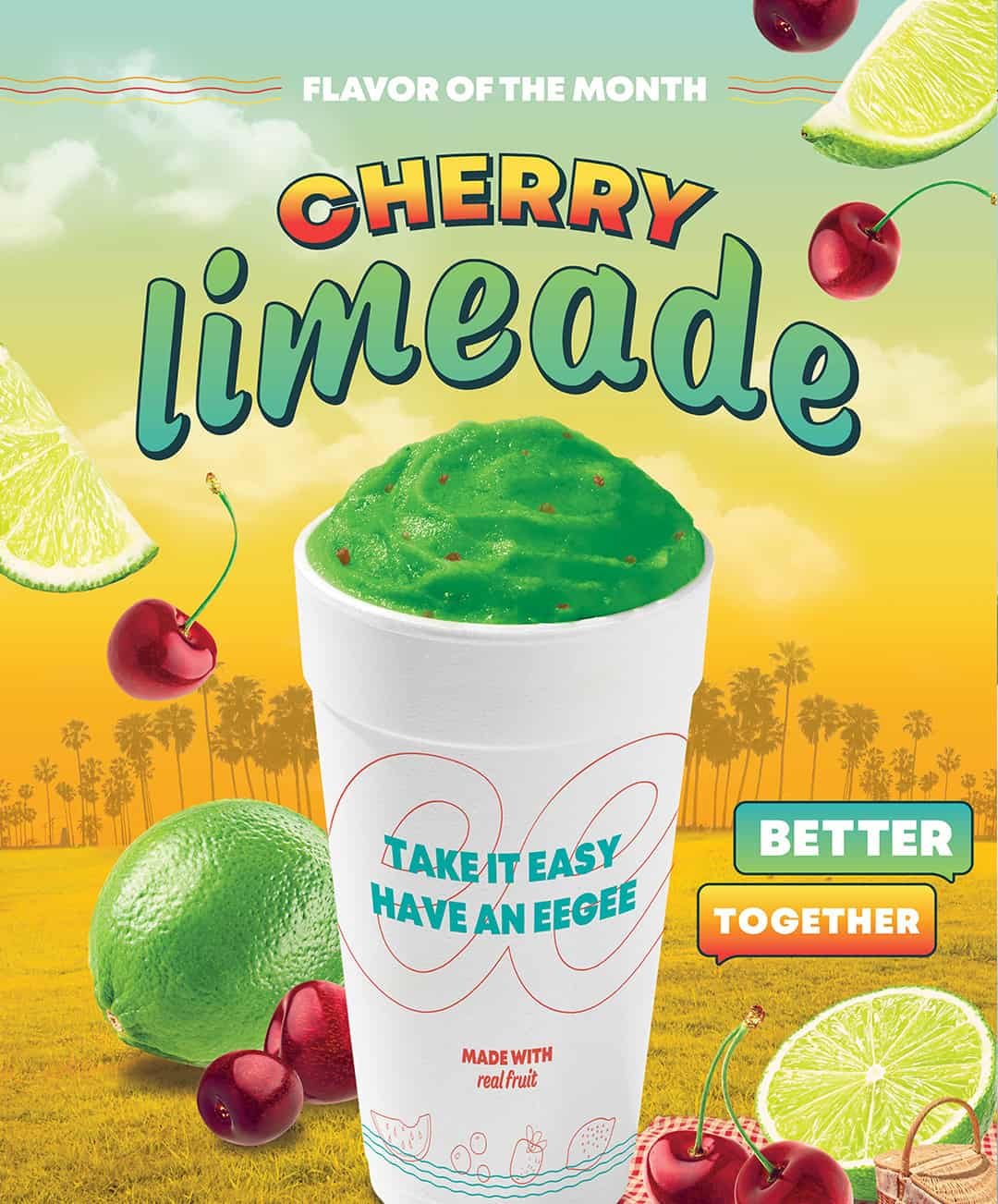
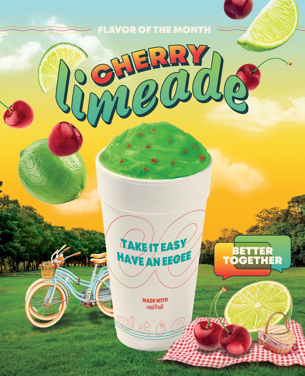
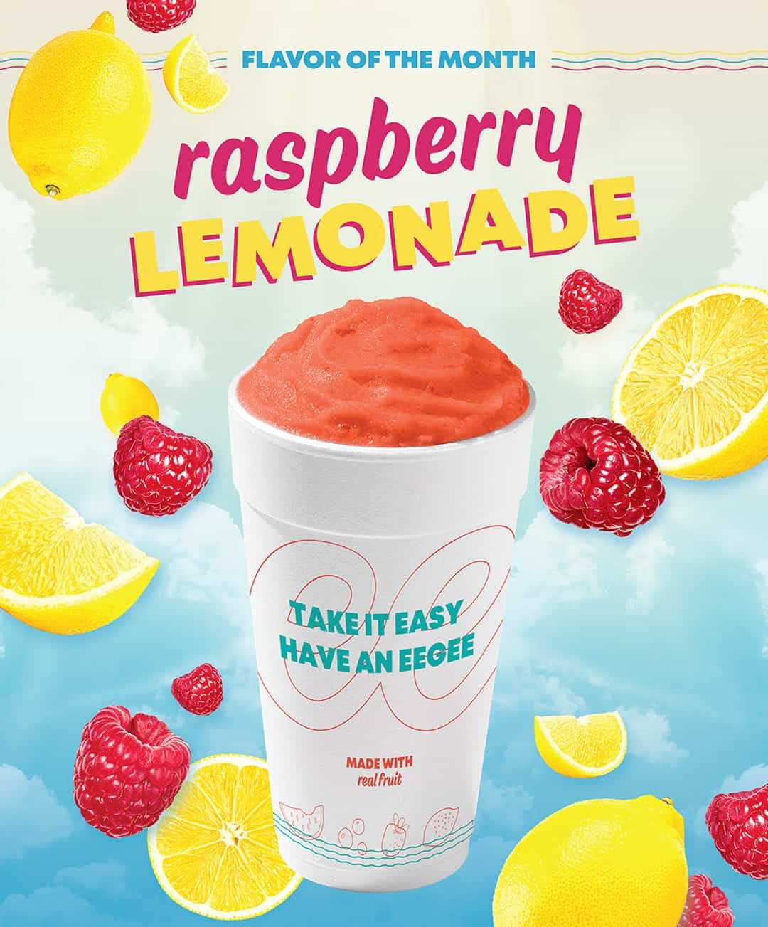
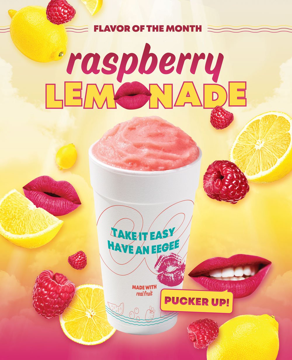
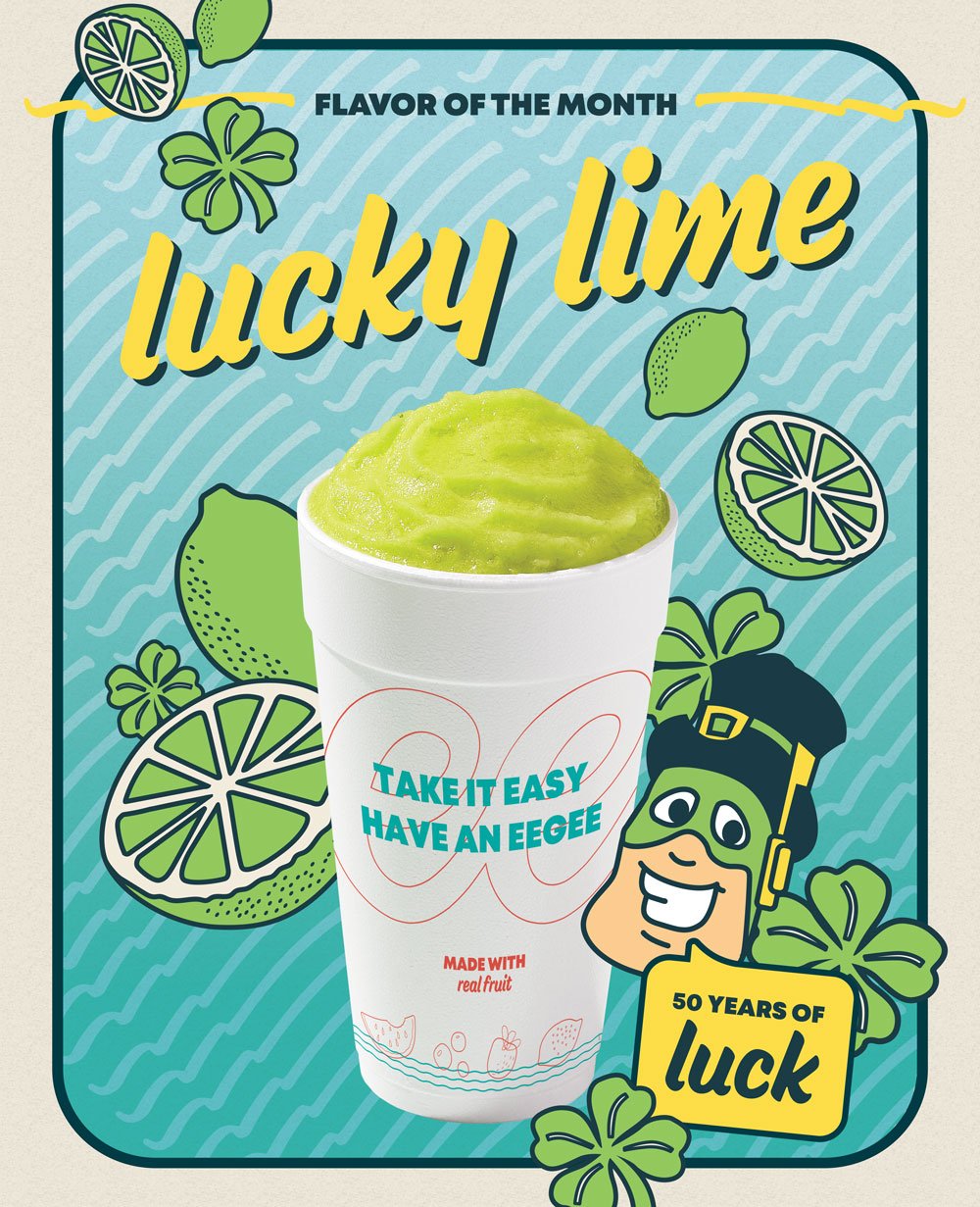
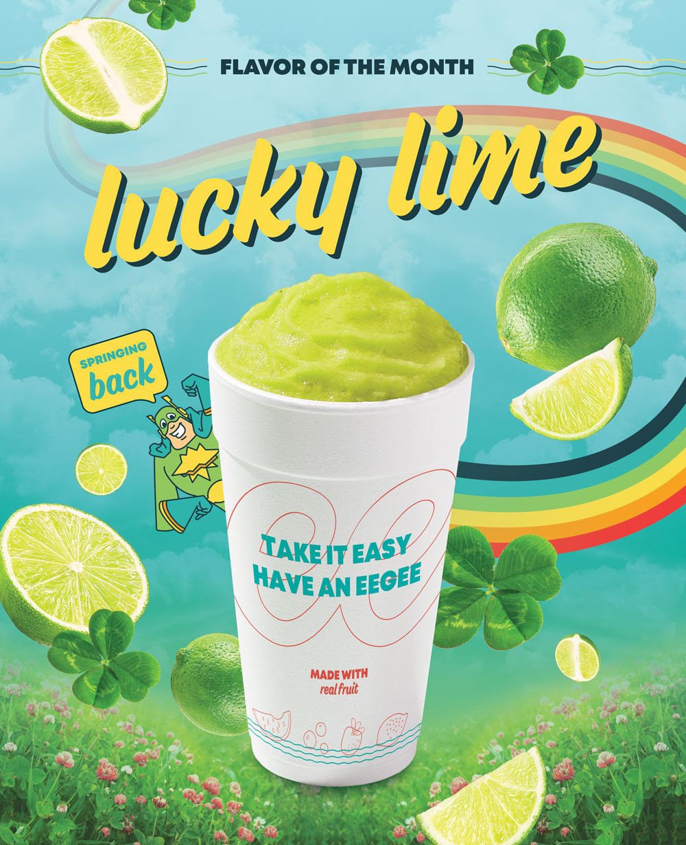
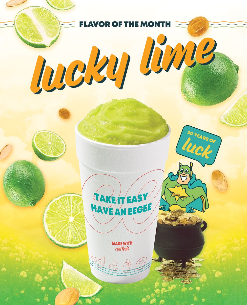
Along the lines of the limited time offer campaigns, there was another type of campaign we handled on the regular; the flavor of the month campaign. If you watched those video ads, you’ll see at the end of each video a shout out for that month’s flavor of the month. See, eegee’s is well known for their slushie-like drinks, and these drinks have an insane cult-like following, so much so that at the end of each month their social channels get bombarded from questions from users about what the new special month-long flavor is going to be. It’s usually the same from year-to-year, with a few wild cards thrown in to keep customers on their toes.
When Vigor took over as agency of record for eegee’s, we approached how the flavor of the month was handled. Instead of the same look and feel from month to month with just the color of the slush in the cup swapped out, we developed full scale conceptual campaigns relating each flavor to an ‘eegee’s moment’. To get a full view of what Vigor did, check out the case study and the final flavor of the month creative directions.
When we pitched the concept from month to month, we’d always show a couple of conceptual directions. I’d like to take a moment to highlight some of my creative art directions that didn’t make it out into the real world, but are marvels of Photoshop magic that I’m still quite proud of.


