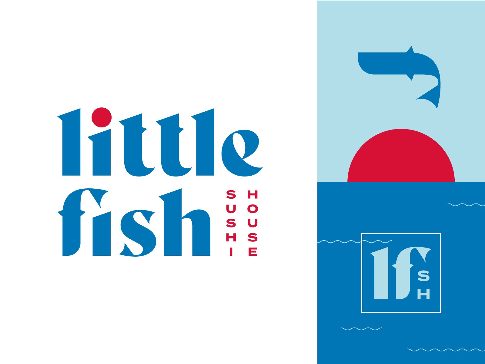
Another little logo designed during my time at Vigor for Scratch Kitchen’s family of brands. This one got to see its day in the sun, and I’m so glad it did. For this mark, I edited existing typography to emphasize each letters sharpest edges, like the blade of a well-maintained Japanese knife. For the letters that featured flamboyant finials (say that five times fast) I added fins, and turned the F into a fish symbol for the brand.


