Project Snippet — VH Beer Can Designs

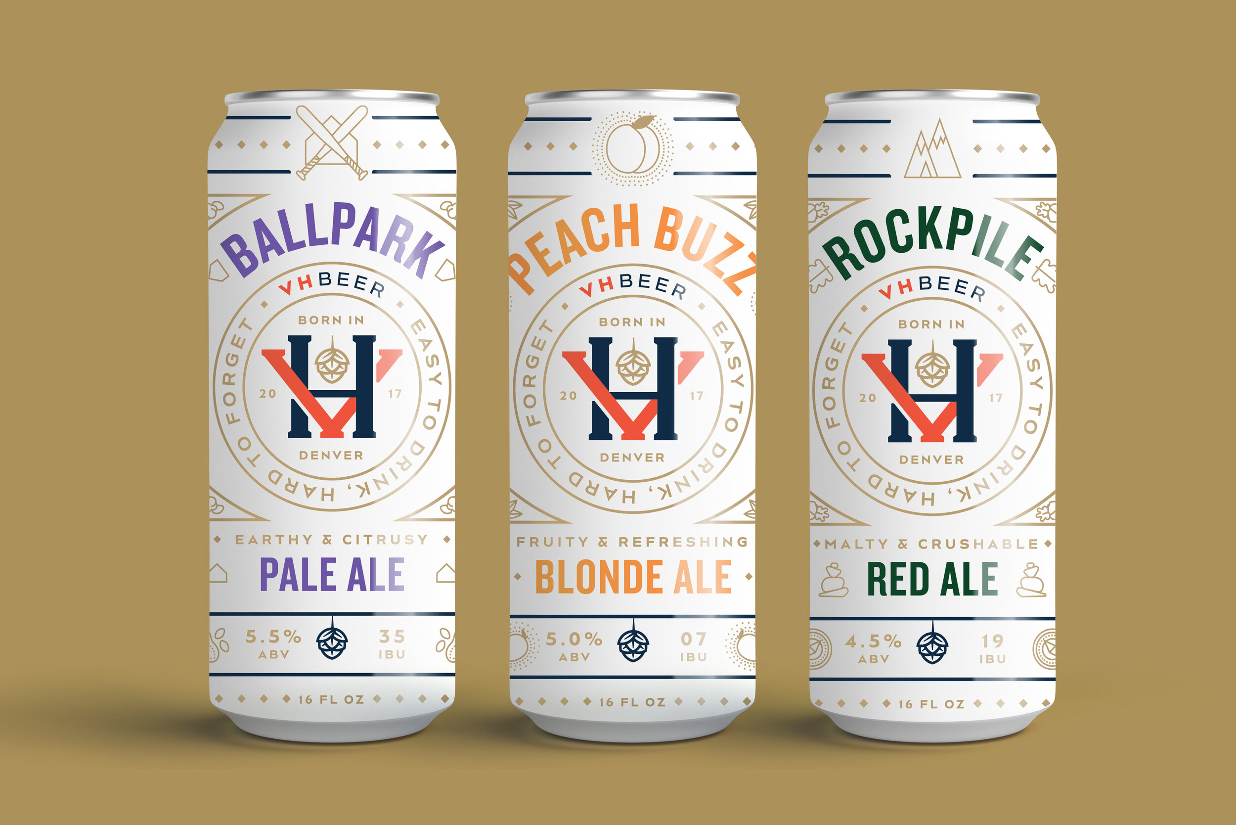
A few months ago, I featured an early exploration of what a marketing campaign could look like for a client of Vigor’s, VH Beer. Before we got to that scope of work, however, we had gone through the process of naming, branding, and designing packaging for the brewery. The directions featured below are were early, unused explorations of what can designs for VH Beer could look like.

To see where the final branding and packaging landed, be sure to check out the case study on Vigor’s website.

VHBeer_MockupD1_Slide1.jpg
VHBeer_MockupD1_Slide2.jpg

As this brewery was a new one on the scene in Denver, CO, this direction puts their logo front and center. I also hoped to create differentiation from a lot of the other over-designed colorful craft beer cans on the shelves by using a limited color palette and creating a literal white space for customers to rest their eyes from the rest of the visual noise.

VHBeer_MockupD2_Slide1.jpg
VHBeer_MockupD2_Sslide2.jpg

This direction aimed to depict the literal scenarios a consumer could find themselves in while enjoying VH Beer. Shoutout to Chia-Yu Hsu for helping me out with the illustrations!

VHBeer_MockupD3_Slide1.jpg
VHBeer_MockupD3_Slide2.jpg

VH Beer is run by the same owners of Viewhouse, a local chain of restaurants / bars. Viewhouse’s name carries a bit of weight in Denver, and so I wanted to make the connection between VH Beer and Viewhouse more apparent by focusing on a shared mascot; the Viewhouse eagle. The eagle is anthropomorphized and illustrated in various scenarios, in which they would find themselves enjoying VH Beer. Thanks again to Chia-Yu Hsu for lending his talent in bringing my idea to life.

Project Snippet — VH Beer Advertising Creative

VH Beer was a project in two parts; the first, branding the Denver-based brewery and designing its line of cans, the second, figuring out how to get the word out there in a way that was befitting of the new brand. Below is one of what we call ‘hero concepts’ I developed to set the tone of voice and visual language for the other advertising creative to be derived from. To see the full case study, check it out on Vigor’s website.

VHBeer_CampaignConceptCreative_vNS.jpg

Inspired by the tagline we had developed during the branding process, I interpreted ‘easy to drink, hard to forget’ in a surreal collage, blending together all the scenes from across the can art into one mesmerizing dreamscape, blasting out from a customer’s cranium as soon as they take a sip.

This early iteration was developed further into what you see on Vigor’s case study, swapping out the customer photo for one of the beer and putting emphasis on the parent brand vs. the line of beer.

Project Snippet — Apotheos Cold Brew Can Packaging Design

Apotheos Roastery has been a client at Vigor for over a year now. It started out as an independent, single-location coffee roastery with big dreams of nationally distributing their cold brew coffee. Over the course of that year, things changed, and now Apotheos, in addition to their main roastery in Kennesaw, will be taking over a chain of a well-known local coffee shops here in Atlanta. As we reach the end of the project and soon Apotheos Roastery will make their brand-debut and be open to the public, I wanted to share some designs that ended up on the cutting room floor. First up, a few unused directions for their canned cold brew.

All these designs feature the same names for the coffee flavors that we came up with at Vigor. As Apotheos is meant to be a community-centric brand, we decided to name each flavor after different personalities that may wander into the roastery. Adventurer, for those coffee drinkers with an adventurous palette, features notes of chocolate, pecan, salt and a touch of cayenne. Maverick, for those who need an extra kick while building their side hustle, is an extra intense double-black cold brew. And Purist, for those who like things plain and simple, is the flagship flavor with no frills. These names carried through to the final can designs, as did some of the iconography developed below.

EDPG_Can_Mockup_vD1ALL.jpg

This first look, and the second for that matter, both blowout Apotheo’s A monogram, putting the cup and droplet hidden in the letters’ negative space front and center while using it as a framing device. You can see the use of the A more clearly in the expanded label view, below. The A in this direction served as a window, peeking into the life of the persona it’s named after.

EDPG_CanDesigns_v1.jpg
EDPG_Can_Mockup_vD2.1.jpg

This second direction is a simplified approach of the first, removing the background imagery and incorporating a gradient for a cleaner, sleeker look. A different framing device was tried on the can’s front to contain the full primary logo that Vigor developed for the brand, but eventually this approach was scrapped completely for a look that shined a brighter light on the brand.

EDPG_CanDesigns_v2.jpg
EDPG_Can_Mockup_vD3.1.jpg

This last direction tried something completely different, focusing fully on duo-toned, abstract imagery to capture the essence of each coffee flavor. Running type vertically down the can created an edgy, contemporary look, and paired with the other type and logo, creating a framing device for the focal point of each can’s image.

I was lucky enough to be able to work on these cans, and other packaging elements for Apotheos Roastery, all the way through to production. Eventually, I’ll link to the full case study once it’s developed, but for now, you can catch a peek at some of the other elements developed for Apotheos Roastery on their Instagram.

Project Snippet — Erik's DeliCafe Medallion & Trophy Design

eriks-delicafe-trophy-02.jpg

Often times at my job at Vigor, we get to do one-off projects that don’t make sense to put into a larger case study. However, a lot of these are also too fun and unique to not write about or show off. This blog series I’m calling Project Snippet, of which this is the first installment, will showcase these kinds of projects and give them their time in the sun.

For Erik’s DeliCafe, a sandwich-chain out of the Bay Area, I was tasked to design medallions and trophies that reflected the updated brand that Vigor had created earlier that year.

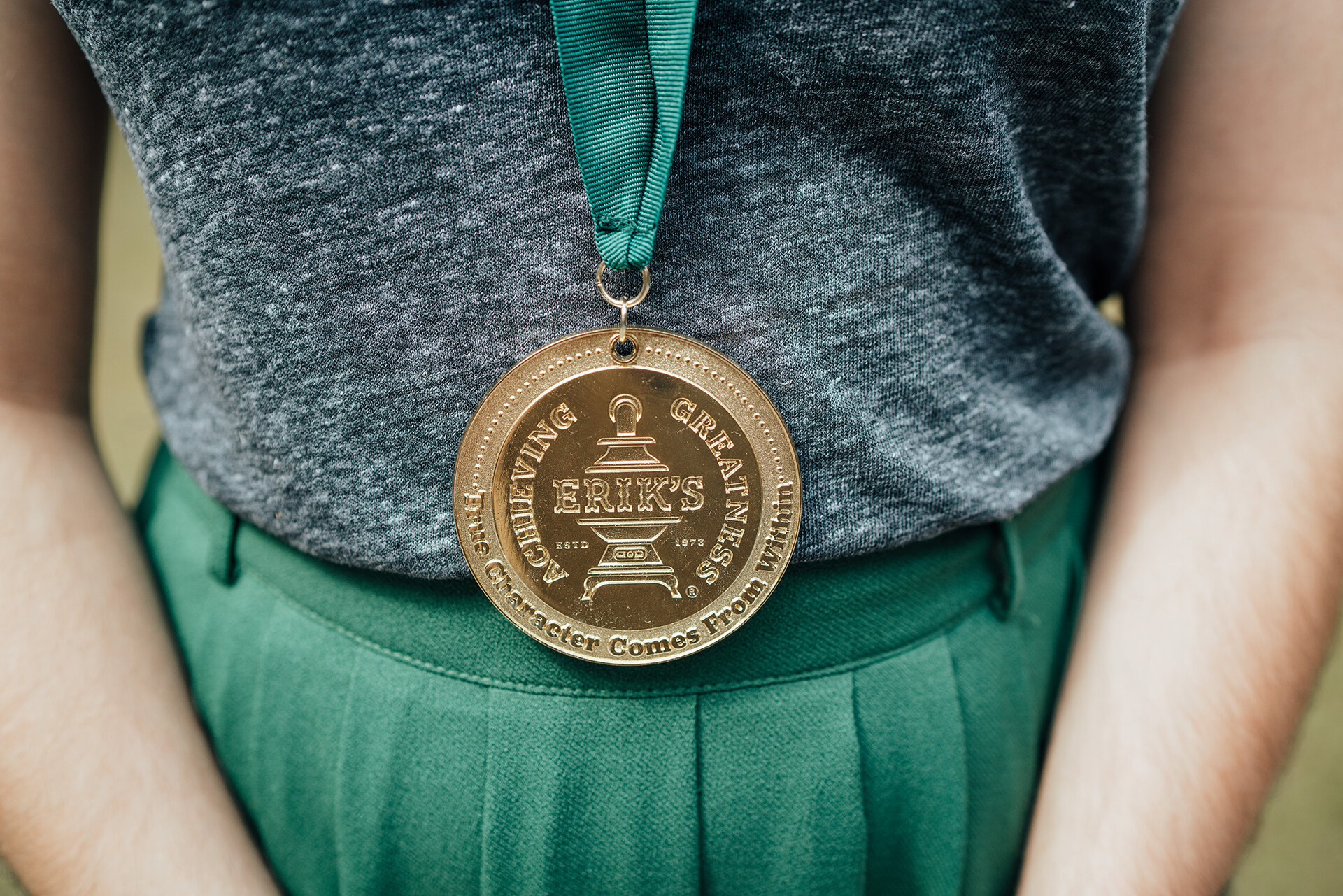
The medallions were to be passed out to exemplary employees; those who either had achieved a milestone at their home Erik’s location or had gone above and beyond their role. We worked with a fabricator local to Atlanta to choose the materials and cast the medallions. They turned out pretty big for my small frame, but overall it was really rewarding when a box rolled up to our office with 100 of these bad boys in it.

eriks-delicafe-branding-13.jpg

The other really cool thing we made for Erik’s was a set of custom trophies that they gave out to their franchisees and managers that had really outdone themselves. My vision was to create a trophy that was as unique as the brand; Erik’s touts a potbelly stove as its logo, so of course, we had to turn it into a trophy. We started by finding a set dollhouse miniatures that resembled the potbelly stove in the Erik’s logo. Then, the E of Erik’s logotype was milled out of strong material and attached to the miniature stove. The whole thing was painted in the brands signature deep green before being adhered to a rustic wooden base. The base was then laser engraved with the specific award. Luckily, Vigor was able to secure a trophy with our name on it.

eriks-delicafe-trophy-01.jpg