I think I’m finally getting the hang of this WFH, quarantine, weird-is-the-new-normal…thing. Maybe its the blazing summer sun that has lifted my spirits but I’m shaking off the dust, updating this blog, and reflecting on myself on a person and as a designer. The world at large is still insane, but I think some good will come out of this chaos… eventually.
Read MoreProject Snippet — The Tinsley Co Photography Branding
Almost a year ago now, my dear friend Chaise Tinsley approached me to help her brand her wedding photography business. She had been wanting to go out on her own for a while and make it her full time job, but wanted to get the branding, messaging, and voice underway before doing so. We went through the discovery phase together and I presented three options for her to choose from. Ultimately, she decided to use another designer that was more in line with her overall vision, but the strategy I devised for her is what she still uses as her north star.
Take a peep at the brand strategy below, as well as the design directions presented with said strategy.
Read MoreProject Snippet — VH Beer Can Designs
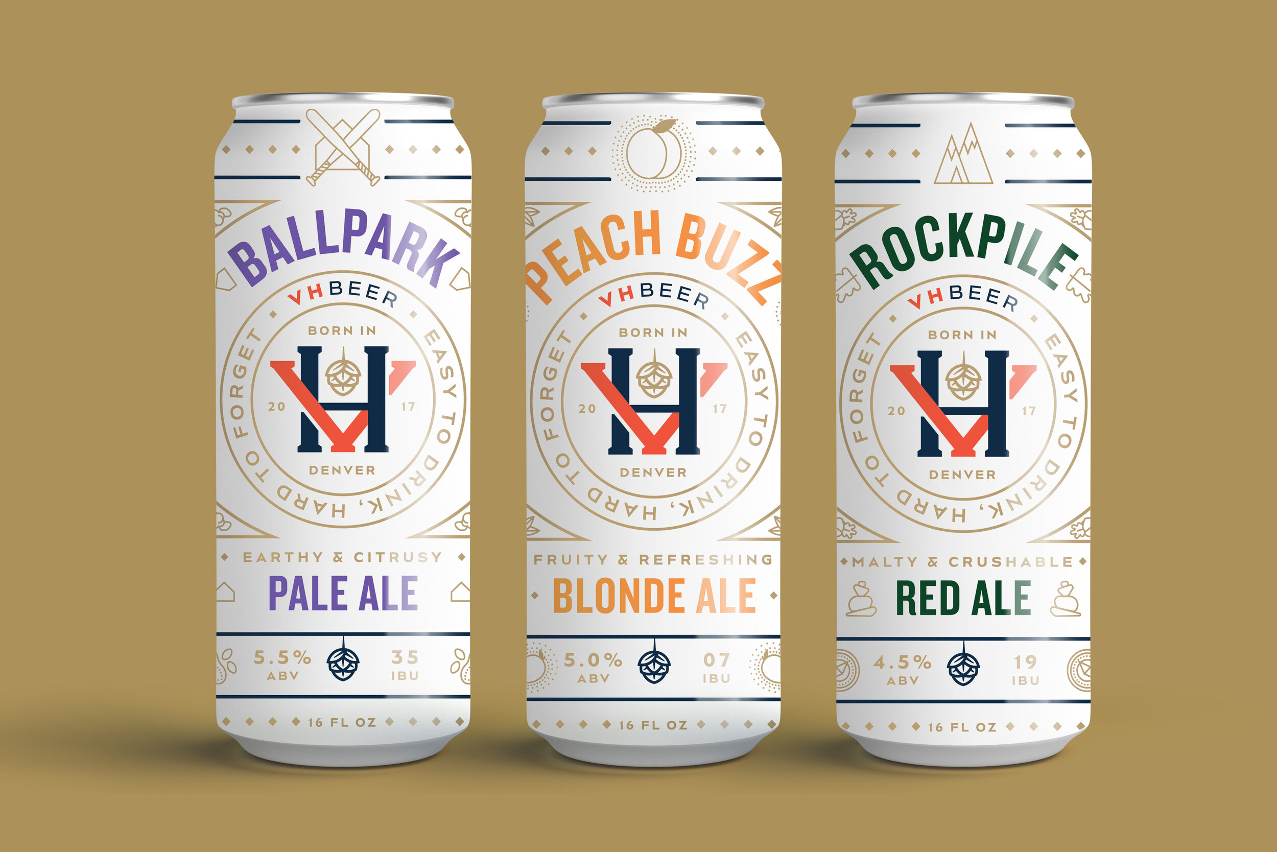
A few months ago, I featured an early exploration of what a marketing campaign could look like for a client of Vigor’s, VH Beer. Before we got to that scope of work, however, we had gone through the process of naming, branding, and designing packaging for the brewery. The directions featured below are were early, unused explorations of what can designs for VH Beer could look like.
To see where the final branding and packaging landed, be sure to check out the case study on Vigor’s website.
As this brewery was a new one on the scene in Denver, CO, this direction puts their logo front and center. I also hoped to create differentiation from a lot of the other over-designed colorful craft beer cans on the shelves by using a limited color palette and creating a literal white space for customers to rest their eyes from the rest of the visual noise.
This direction aimed to depict the literal scenarios a consumer could find themselves in while enjoying VH Beer. Shoutout to Chia-Yu Hsu for helping me out with the illustrations!
VH Beer is run by the same owners of Viewhouse, a local chain of restaurants / bars. Viewhouse’s name carries a bit of weight in Denver, and so I wanted to make the connection between VH Beer and Viewhouse more apparent by focusing on a shared mascot; the Viewhouse eagle. The eagle is anthropomorphized and illustrated in various scenarios, in which they would find themselves enjoying VH Beer. Thanks again to Chia-Yu Hsu for lending his talent in bringing my idea to life.
Of Note — April & May 2020
Ok, ok, so I missed posting one of these in April… I honestly forget about it among everything that was going on in the world at large with COVID19 and when I did remember, it was a week into May and I didn’t feel like I had enough content gathered. Being shelter-in-place for a month and a half and disappearing into video games to escape had left me listless and unwilling to do the usual reading/watching/exploring I did in my free time. So, I’ve done my best to shake off those feelings and am trying to re-commit myself to this blog…. however, I think one Of Note every two months may better suit my current life-pace.
Read MoreProject Snippet — VH Beer Advertising Creative
VH Beer was a project in two parts; the first, branding the Denver-based brewery and designing its line of cans, the second, figuring out how to get the word out there in a way that was befitting of the new brand. Below is one of what we call ‘hero concepts’ I developed to set the tone of voice and visual language for the other advertising creative to be derived from. To see the full case study, check it out on Vigor’s website.
Inspired by the tagline we had developed during the branding process, I interpreted ‘easy to drink, hard to forget’ in a surreal collage, blending together all the scenes from across the can art into one mesmerizing dreamscape, blasting out from a customer’s cranium as soon as they take a sip.
This early iteration was developed further into what you see on Vigor’s case study, swapping out the customer photo for one of the beer and putting emphasis on the parent brand vs. the line of beer.


