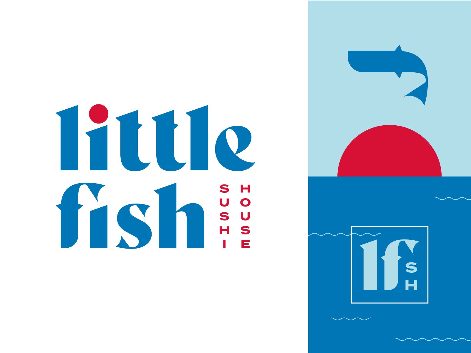
Another little logo designed during my time at Vigor for Scratch Kitchen’s family of brands. This one got to see its day in the sun, and I’m so glad it did. For this mark, I edited existing typography to emphasize each letters sharpest edges, like the blade of a well-maintained Japanese knife. For the letters that featured flamboyant finials (say that five times fast) I added fins, and turned the F into a fish symbol for the brand.
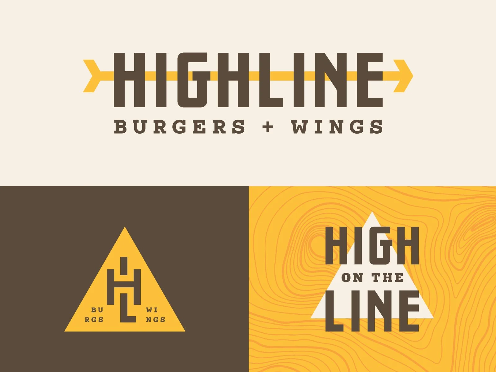
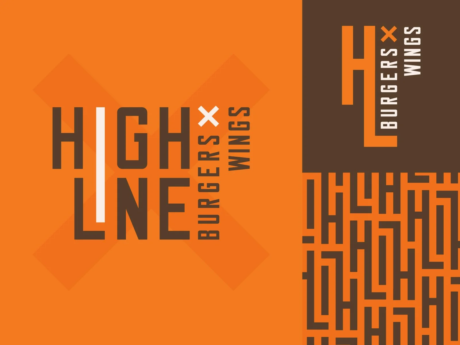
Project Snippet - Highline Burgers + Wings
One of my favorite (and least favorite) things about being designer is finding long-forgotten little designs when cleaning up folders and files. Both these logos were developed during my time at Vigor for Scratch Kitchen, a virtual restaurant based out of Boulder, CO.
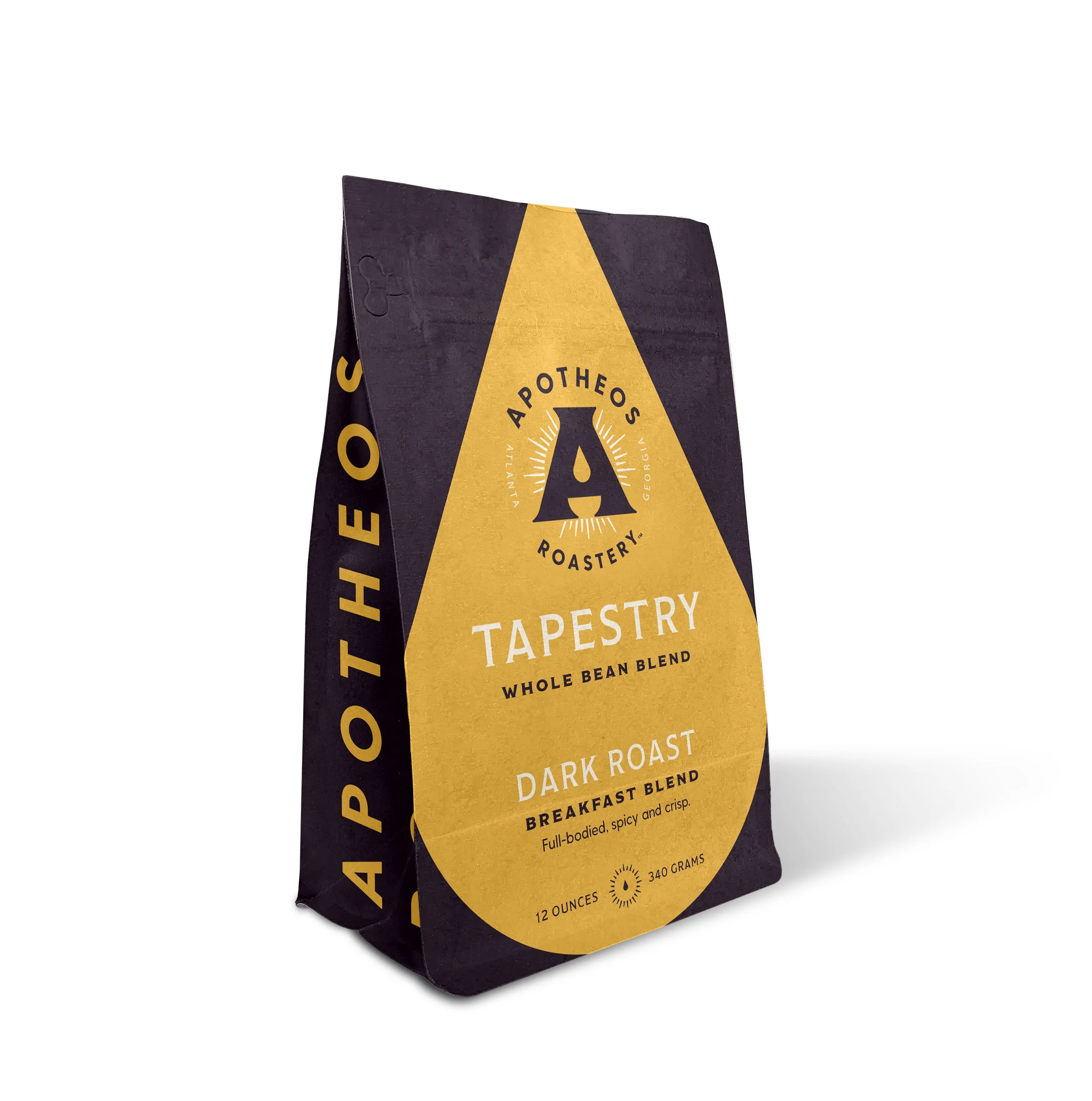
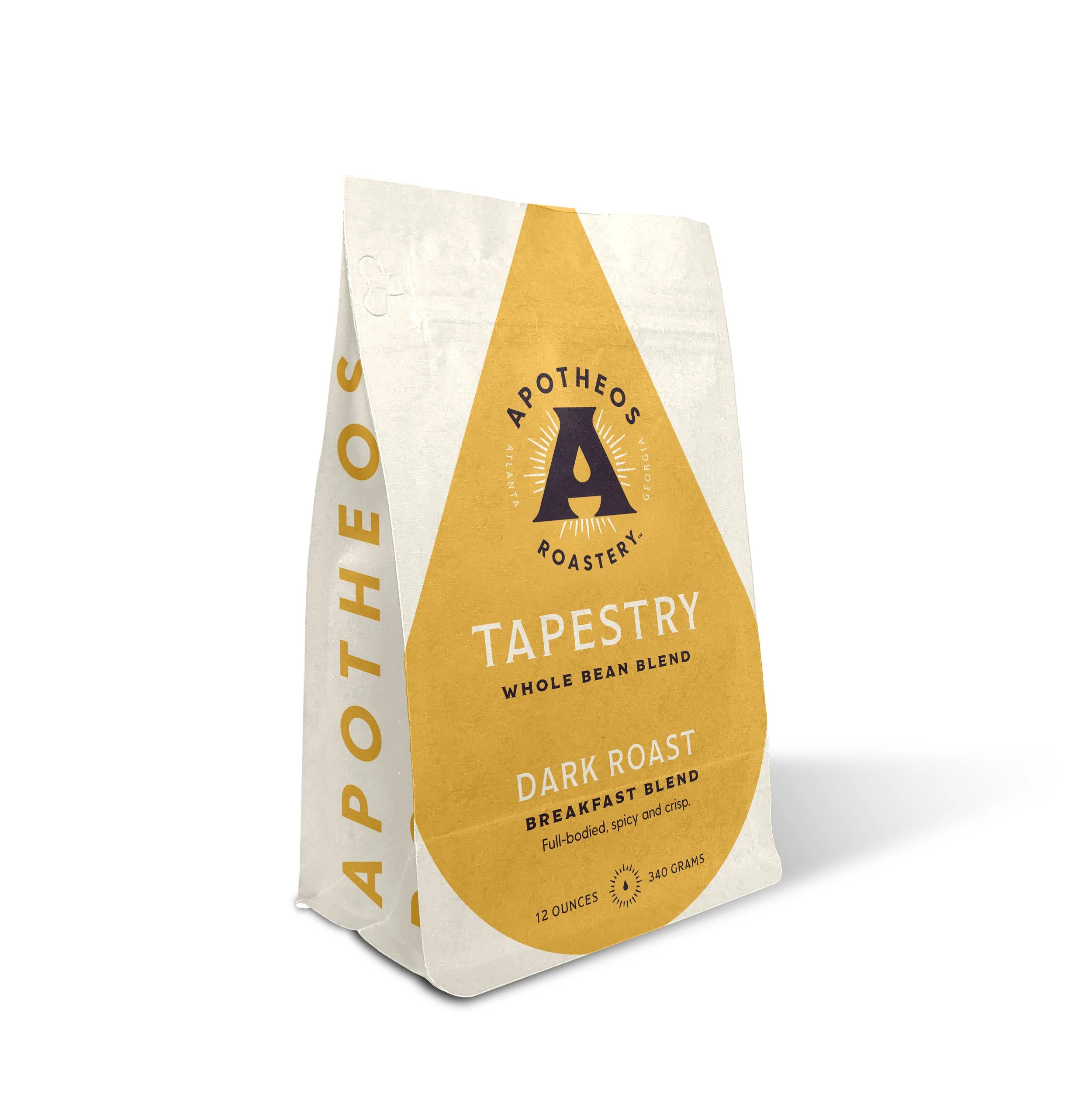
Project Snippet - Apotheos Coffee Bag
About a year ago I wrote about the early design explorations for Apotheos Roastery’s cold brew coffee cans. I’ve recently published the full case study as well showcasing the final can designs, and some temporary bags that Apotheos was using at the time the photos were taken. Well… it turns out the bags I designed were never meant to be, and they employed another designer to revisit the bags and print them. Which is ok! It happens, I understand. Still a little sad about it but I get it.
So! To honor those bag designs that never got to see the light of day, I want to showcase them in their full glory here in a Project Snippet, and also some of the earlier explorations that lead to the final designs.
This first set of unused designs explores a very modern, clean and maximalist approach to the bags. The oversized golden droplet draws the eye regardless of being on a light or dark background. Ideally the dark bag would have been a dark roast, the light bag would be the light roasts, and a third undetermined color (probably a light purple) would’ve been the medium roast.
This second set of unused designs was inspired by vintage marbled end papers that you’d typically find in old books. The idea was that each bag’s marbled pattern (depending on the kind of roast, the name of the roast, and the tasting notes) would change in form and color to reflect the qualities of the coffee beans inside. You’ll note that the sides of the bags here are all different. I was playing with different typographic layouts, inspired by old book spines, and was undecided on what layout would work best to harken back to the point of inspiration and still ribbonize well across different bags. You’ll see in the next set that the book spine idea made its way to the final coffee bag designs, despite the end paper idea being a little too complicated to bring to life.
The final and approved (but not produced :( ) bags feature some design choices from the previous two iterations. The lighter flood of cream on the face and back of the bag allow the logo and brand to take center stage, while an accent color that designates the SKU is used on sparingly on these planes. That accent floods the sides of the bag, revisiting in the book spine motif from the last direction. A custom icon was also designed for each SKU, representative of the products’ name.
Of Note — Spring (and half of Summer) 2021
Ok so it’s summer now, which means I’m pretty behind on this. I started a new job in April and have been focused on that transition, so maintaining my ~ * personal brand * ~ has taken a back seat to that. But! Now that I feel like I’ve got a good grip on my new position and taken some much-needed R&R, I’m ready to jump back in the saddle!
Read MoreProject Snippet - Virginia Distillery Co Hero Image
If you’ve been keeping up with the new work I’ve been posting, you may have seen my Virginia Distillery Co. - Courage and Conviction Launch Campaign case study. I wanted to share the initial artwork that turned into the final work, as I think it still has some merit, despite it having a slightly different vibe.
The initial concept was centered around the consumer, defined as late-30s / early-40s successful types with a penchant for taking on what are considered ‘upscale’ hobbies, IE playing piano, yachting, etc. The angle here was to present Courage & Conviction as a refined product to pair with these hobbies, a special single malt whisky you broke out to celebrate big personal goals. This look was softer, quieter, more customer-focused approach compared to the final campaign, which focused more on the rugged American spirit and craft that went into creating the whiskey.

